This is an user interface nightmare. It has 2 different sets of unnecessary, duplicated information, it obscures several other instruments and doesn’t accomplish anything more than the old, minimalistic tooltips:
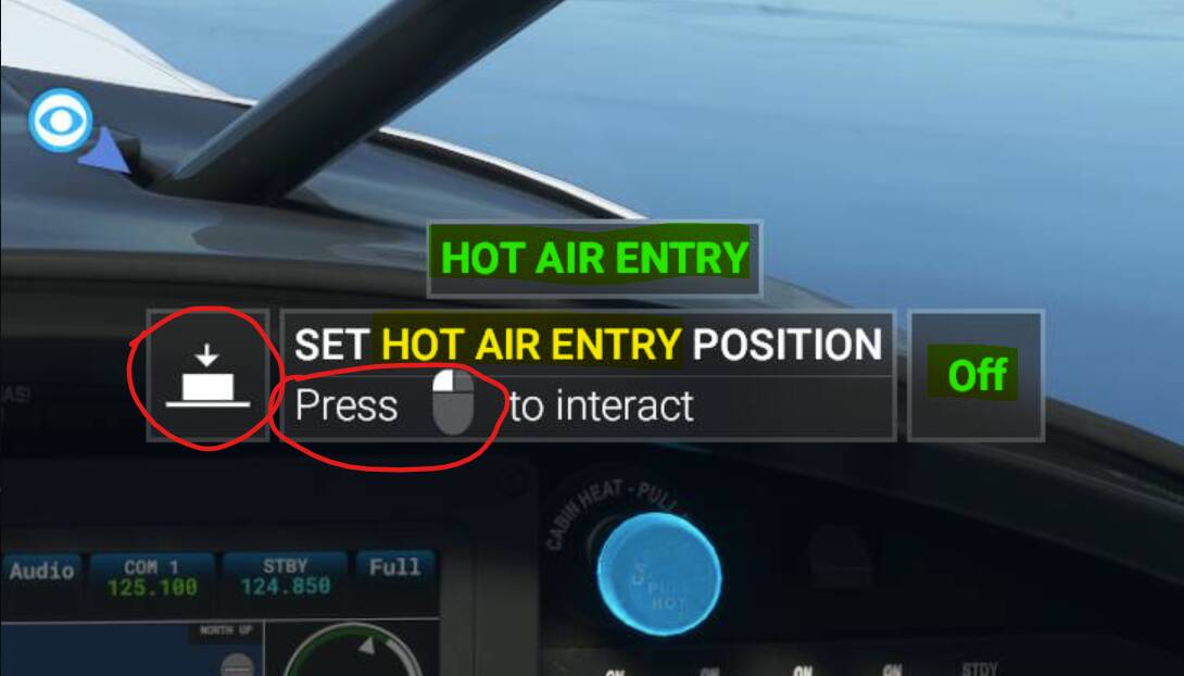
Two different sections telling me to press/click. Name of the instrument/switch repeated for no reason. We only need the two parts in green, the rest is visual pollution.
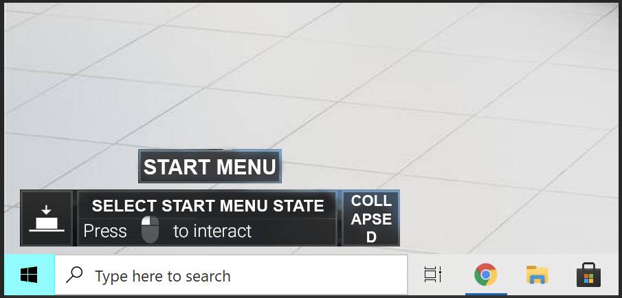
Could you imagine if Windows had such tooltips?: