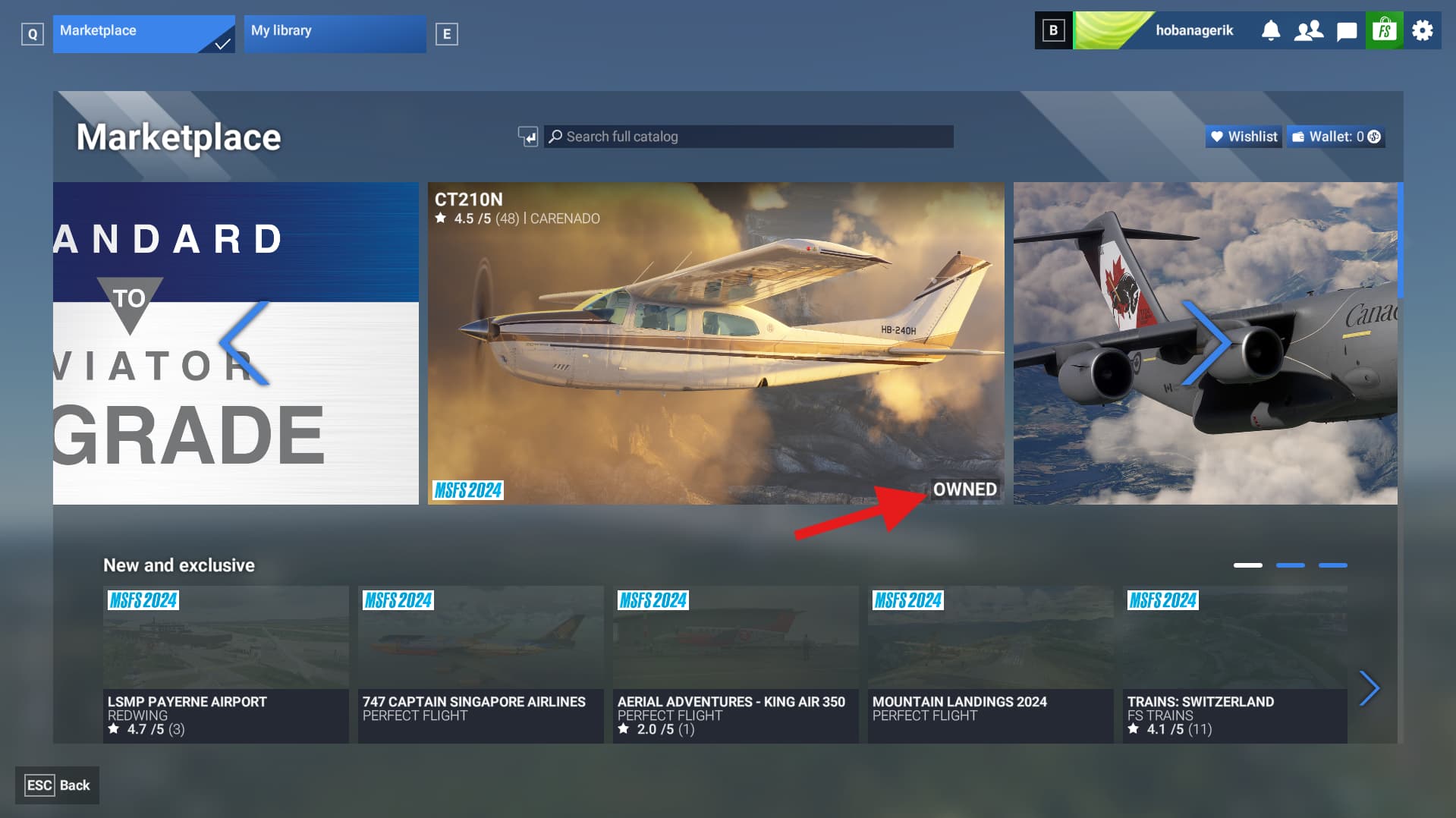
This is what I’m greeted by when I enter the Marketplace.
Why are those top tiles so large? I would make that top row disappear altogether. It serves no purpose, and would instead be better off being an expanded “New and exclusive” section as shown slightly below.
You would think that MS would have learned from their bullish, but failed attempts to foist a tablet style interface on to us with Windows 8/8.1, even for those of us without touch screens, before eventually conceding defeat.
Why are three of the 5 items in that top row things I already own, one of which I have highlighted? A huge change here would be for the default view to hide already owned items.
Move the menu below to the top, and pin it in place so you can always jump between selections more easily.

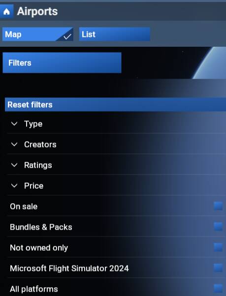
Probably just below this section:

Allow this filter menu to be accessible all the time, and not just after you have selected one of the subsections first i.e. Aircraft, Airports, World etc.
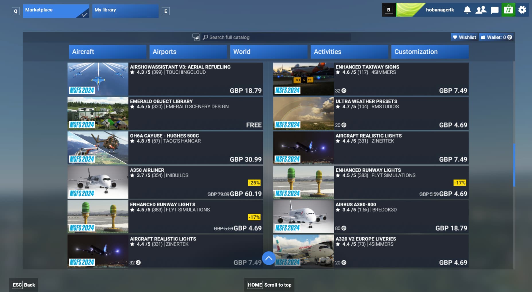
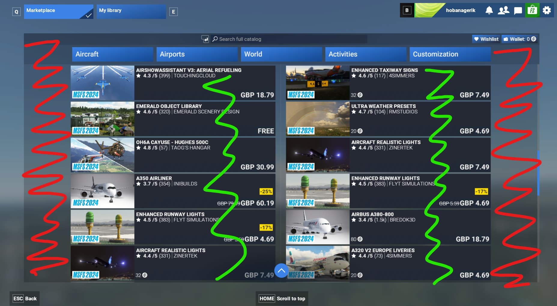
While looking at this, and running through the interface options, I did a search for what planes were on sale.
Of the 63 items for sale, only 15 of them were by someone other than “MScenery”. 
The search bar at the top is far too aggressive at running a dynamic search. If you are a quick typist, and make no mistakes, you can enter what you need to. However, if you are slower, or pause to delete a few characters, it will run a dynamic search with every keypress! Please change this so it only runs a search when the ‘Enter’ key is pressed.
If you move the mouse away from the search box, it clicks away from it so you cannot enter text any more.
You cannot move the cursor keys around, in case you have made a typo, so have to delete all the characters to before the error…all the while dynamic searches are being ran.
Sometimes the text entry cursor will get moved back, with a trailing character that you now cannot delete unless you delete all the text by press the X to the right.
Honestly, I’d like to adjust my earlier overall 4/10 review of the Marketplace interface, and demote it to a 2 or 3. It’s honestly one of the most painful interfaces I’ve had to use, and I’ve had to support some clunky CRM suites over the years.


 ratings too and I had to have a laugh. Who the hell is rating their planes now I wondered. I suppose one of the devs in that company actually bought a copy of MSFS 2024 and has started bigging up their own products