I’m still working my way through WU21. Yesterday I was at Broken Hill (YBHI).
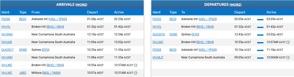
As I mentioned in the WU20 (Japan) poll & feedback topic, it would be nice if - since one can enter the terminal - if the signage was appropriate for the location. For example, at YBHI we see this Arrivals board:

Rather than (from FlightAware.com) something like this:
and oddities like an employment application - perhaps this is a subtle request for Microsoft to hire the graphic artist as an employee?

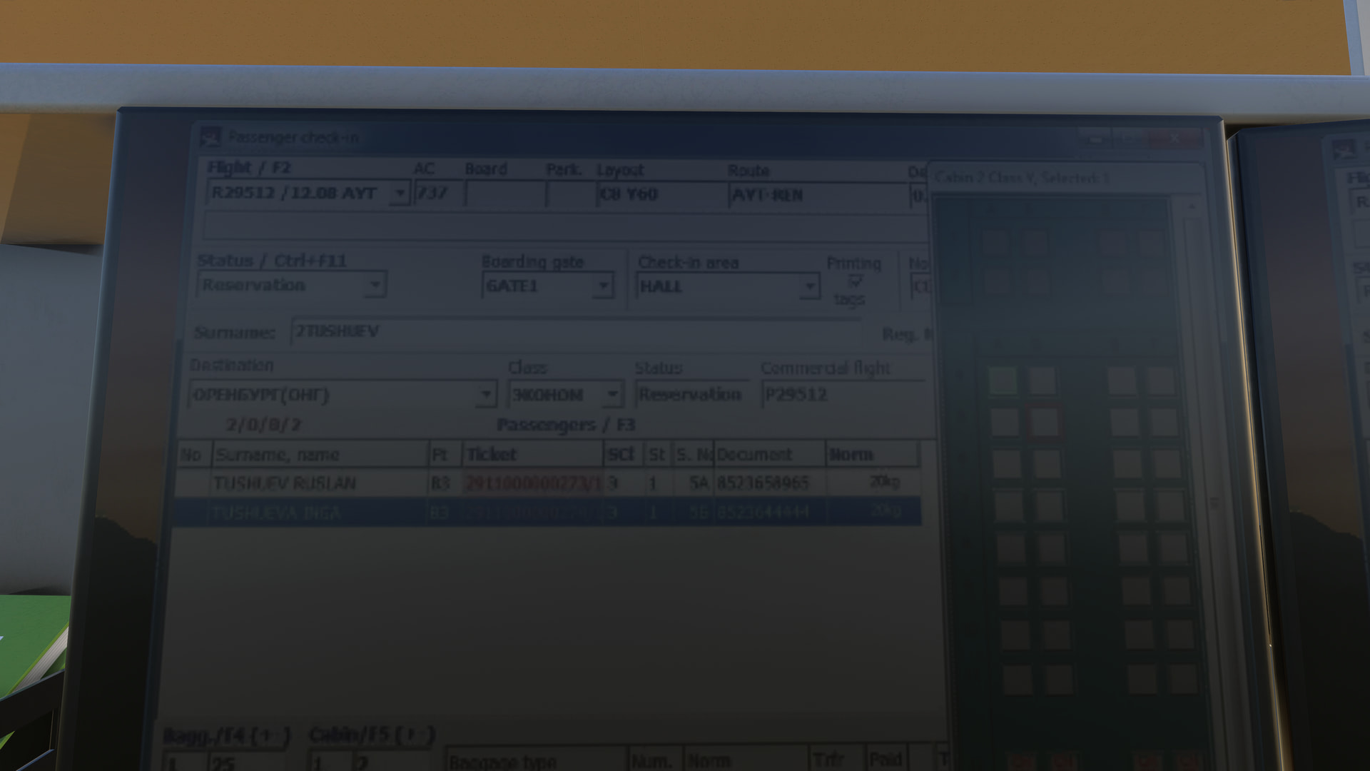
Terminals displaying passenger checkins for a Russian(?) airport:
Then there are blank signs:
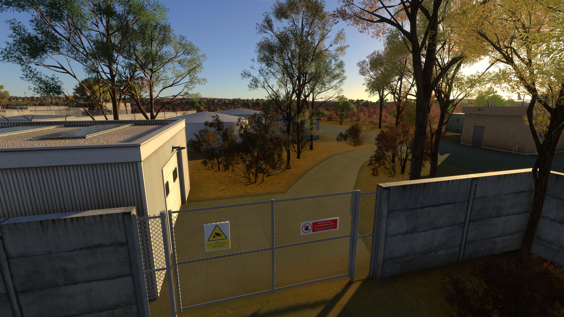
Signs on the wrong side of the fence (I took this when inside the restricted area, pointing to the outside “public” area) :
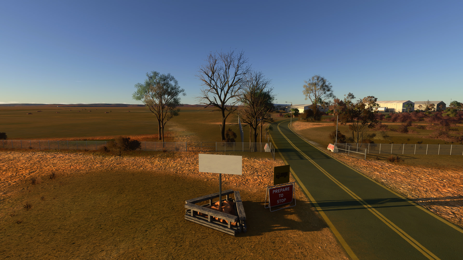
and signs that, if you follow them, lead one in the wrong direction - e.g.:
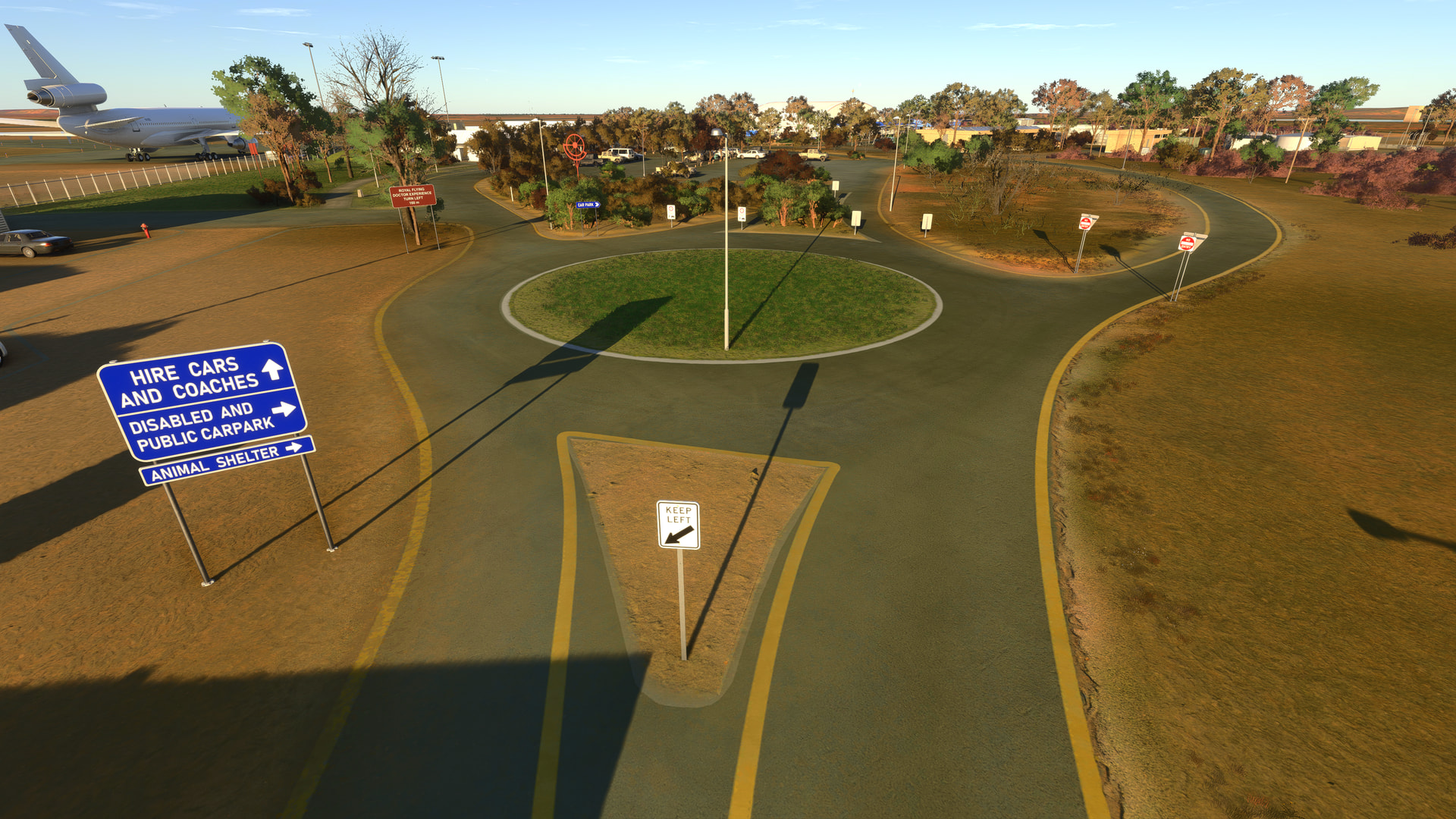
(Go on - try walking around the airport environs by navigating using the signs and see where you end up!)
Also, as mentioned too in my WU20 feedback, having a few of the hangars open, rather than all as closed, would be appreciated.
Finally, I think a great opportunity was missed here in that the interior of the Royal Flying Doctor Service museum was not modelled. The RFDS is an iconic part of Australian aviation history. Being able to walk your avatar through the museum & see the exhibits would have been so cool. Performance-wise, it would have little impact, as there would be no need to render the interior at all beyond a few meters, since that would take one outside, so making the interior “invisible”.
It’s not like this cannot be done - have a look at the First Flight airport (KFFA) that is part of the base sim to see how realistic & accurate displays & signage can look in 2024.