Can we please get some tweaks for the light theme to bring it closer to functional parity with the default dark theme? I realise there are way bigger fish to fry at the moment. I’m only bringing this up now because I will forget in a few days time.
I know most of us use the dark theme, partly because it is the default, but also because dark themes are always better than light themes. But some users struggle to use the dark theme, partly because of eyesight issues.
Here are a few issues I have noticed with the light theme:
-
Category moderators are visible on the About page. In the dark/default theme, they are only visible to staff and the Tl3 moderator group. This can be fixed by copying this small CSS snippet from the dark theme into the light theme:
body:not(.staff):not(.tl3-moderator) section.about.category-moderators {
    display: none;
}
For bonus points, seeing the tl3 group isn’t really used, you could go as far as to remove that from both the dark and light themes. i.e. The above could become
body:not(.staff) section.about.category-moderators {
    display: none;
}
-
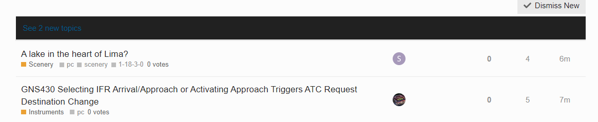
There are some issues with base colours on the theme. For example the “X new or updated posts” bar
or the colour of icons on the navbar

I’m sure there are other things that could be tweaked, but that was about as much of a light theme as I could stomach #darksthemeforever.
If any of our light theme users want to make these or other QoL changes locally on your computers but don’t know how to, feel free to reach out to me and I can give you a hand.