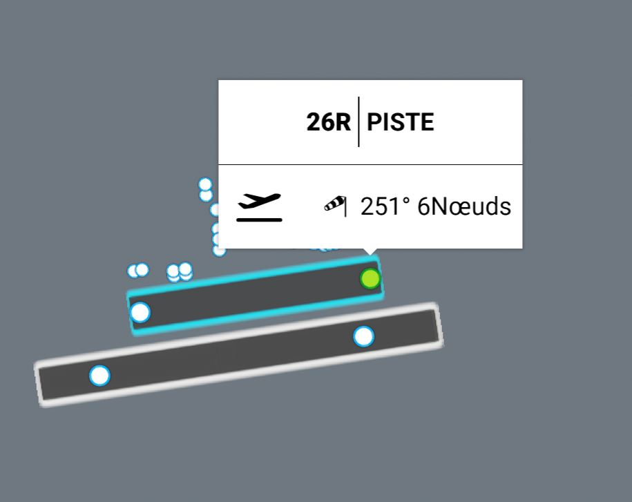
Could the Map labels (Deps and Arrivals screen) be made MUCH smaller, as they block a LOT of visual information. A better idea would be to have a line pointing to the area where the label is now, and the label placed away from it (which could also be much smaller), so you can see (In this case) the actual SID track, THANKS!

6 Likes
I agree. Even just for selecting departure ramps / gates, I’ve found the white box with airport name and the weather covers some of them. Another thing you’d think would’ve been picked up in testing…
Agreed, sometimes I see labels upon labels as well! Cant shift them out of the way ![]()
I see this all the time in mapping programs. Labels are placed right next to or even right over the top of the area you’re interested in. Contextual information shouldn’t even need to be in the mapping area let alone right on top of what you’re clicking on. Stick that info in a designated box somewhere else in the UI out of the way.
1 Like
Can only agree…even a right click to reveal important info would be better than this. I REALLY hope they fix this soon as it’s virtually unusable as it is
Zoom in the get under the label.
Thanks for that tip!
Hello,
The labels on the airports when choosing the gates hinder the view of the entire airport.
Is there a corrcetif so that it is possible to move the label or deactivate it
Good flights.
3 Likes
Totally agree it’s mad you cant see the actual airport details
1 Like
Agree. Something that annoys me quite often.