Marketplace design/layout could use an overhaul

So, this has been bothering me sine MSFS’s release. I recently searched the forums but couldn’t find anything similar.

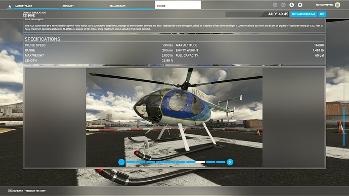
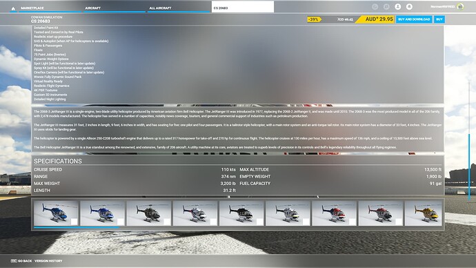
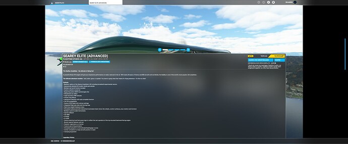
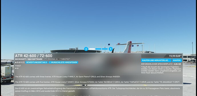
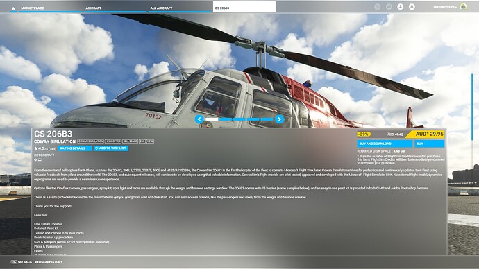
Once on an individual products page, does anyone else find the design/layout of the marketplace terrible? One can cycle through any number of full screen/background images, but the product information/text boxes cover at best half of these images. There’s no way to view these images obstruction free.

Secondly, whilst better, the second cyclable image library cannot be enlarged to view full screen, and can only be viewed in position, at roughly 1/4 size compared to full screen.

Lastly, and as bad as the first, the final image section has a scrollable selection of images in thumbnail size only. Incredibly, these cannot be enlarged at all!

In summary, we have full screen images half obstructed by other data, as well as quarter screen and thumbnail size images that can’t be enlarged at all. Sometimes the developer doesn’t even include the 1/4 screen images, so all we have is the obstructed background images, or a bunch of thumbnails.

Why is it impossible to get an unobstructed image at or close to full screen size? It’s a design decision that completely baffles me.

But maybe I’m the only one that feels this way?
7 Likes

Only thing that really bothers me is no one fills out the version history i would make that mandatory

4 Likes

II’ve resigned myself to these XBOX views/designs, unfortunately.
Be glad you don’t play a higher resolution because that’s what it looks like then.

Reported as: User Interface - UI not resizing / not using full screen

I haven’t bought from the Market Place yet but looking at your pics I would have to agree.
Was recently looking at buying a car online…most had about a dozen pics internal and external.
A picture tells a thousand words.

The whole User Interface is extremely cumbersome to navigate and use. It looks unappealing, it’s slow, unattractive and uneasy to percept scalings and proportions. It would require a complete overhaul.

The marketplace is just mirroring the UI issues ^^

Additionally, the images take longer than I feel they should to load, especially when there are numerous images to view.

Also I really feel that Dev’s should be able to post a video clip (and kind of should be a requirement IMO for aircraft)

1 Like

I shouldn’t laugh, but that is hilariously bad.

2 Likes

I find most of the interface OK, and the main marketplace interface is similar to other marketplace stores and usable enough. But I agree on the product page, it’s a triumph of bad design over functionality.

I fully agree with the problems highlighted on the images. I don’t even look at the image reel at the bottom, sitting on my sofa that is about as useful as a strip of 35mm negatives held up at arms length. The obscured pictures are useless. The only useful pictures are the ones in the panel below the text. At least on my TV these are quite usable.

The load time of each image is like watching a 14k4 modem. Google can search the whole internet, return a page with dozens of hits and a bunch of images, and the whole thing loads in the blink of an eye. Meanwhile I click right on an image in marketplace and it takes seconds to load the next one. It’s like it has to pull it off tape or something.

If the images are going to be slow to load (and that itself should be fixed) at the very least they all need to be preloaded when I open the page. Waiting until I’m ready to view each image before even starting to load it is a huge UI fail. At least it does queue up the loads, so every time I open the product page I immediately click through all of the images as fast as possible, then I read the page, and now the images are all loaded so it’s ready for me. Forcing users to jump through hoops like this is a fail.

Another problem with the product page, ironically, is that it’s really hard to use with the xbox controller on an xbox. It has real issues with getting input focus on the various panels, meaning that it often doesn’t scroll images when it should. If I have the controller in my hand then I tend to use it on the UI without even thinking about it. It all works fine until I get to a product page but then the difficulty of using that page nearly always has be casting the controller off and reaching for my mouse, with which the page is much easier to use.

A quick related feature request. It’s great that the marketplace has a map to easily see airports in a location. It really needs to be extended to include other location based add-ons, especially localised scenery such as city packs. Scrolling through an effectively unsorted list of places in the world looking for related content doesn’t work at all.

you can change the UI scale / font size. I think they’re under the accessibility settings.

I still haven’t figured what ‘Last Seen’ is supposed to mean

yep, we discussed that in the other topic… also the point “why” I not do that ( I dont like gigant “notes” in-flight" :slight_smile: )


yep,… enough to buy a plane, but far to be good. And I assume thats what the OP want to mentionen.

Its for me just the expectation which a PC user have how a PC application should looks like, and that MSFS tried to be a hybrid of PC and XBOX.

Isn’t that a list of your recently viewed items in the marketplace (presumably to make it easier for you to find them again) or are we talking about different things? (Playing in German)

Probably but as I only ever buy on recommendation of these forums I don’t really browse the marketplace. Maybe that’s why last seen always seems just a random pile of nothing that ever interests me. :laughing:

2 Likes

I posted a thread or two on this a long time ago, probably got dropped in all the forum redesigns.

I totally agree. The whole I’ll call it “Xbox Style” interface as implemented is just horrible. I’ve been told it has something to do with its design being based on navigating it with an Xbox controller, but, I’m sorry, there’s zero excuse for all the things you point out and more. I’m not complaining about it being an Xbox style interface, just that the implementation is half-hearted. They could easily design that you slide the cursor to the image you want and hit a button to expand an image so you can view it. I can’t believe all the buttons on the controller are used and there’s none available.

I go to the Marketplace to see the product, not read a bunch of words that mean nothing really without being able to look at the product. Not to mention the quality of the description is pretty bad, for example, half the time they don’t even say what state a given airport is in; at least they added the map for searching for scenery… I like that.

I have zero idea why they bother allowing multiple background images you can’t see because it’s covered by a bunch of useless words. I don’t mind having the background image sitting there, but it is not a sales tool when you can’t see it. It’s as if a programmer with zero UI interface experience and zero sales experience was given a task and they said, “ok, here you go!” (Ok, I’m being a little mean, once I’ve seen the product, the words can have more meaning… depending on how well the copy is written)

And the funny thing is they force in the Marketplace Dev tool that all images have to be 4K! Why bother when you can’t see them???

And the Hangar interface is just as bad. On my 4K TV, the bottom row of images is always blank, sometimes almost two rows of blank boxes. And the images fill in right in front of me, instead of loading them before they come into view! It’s jarring, distracting, and sooo annoying. The livery icons are tiny for no reason. You can barely see them. And my eyes are fine and I don’t need reading glasses for very tiny text.

I don’t care if they are following some universal guidelines for Xbox user interface design. If that’s true, those guidelines need revision. Or perhaps somebody at Asobo who’s a little more creative in “following the guidelines”.

1 Like

One more thing… Maybe they’re not done yet, but, the Hangar is such a wasted resource! They could do so much more with it.

  1. Why can’t I cursor around large planes???
  2. Why can’t I move around the plane with the drone camera? They’ve developed such a beautiful rendering engine, let us use it to admire these planes, walk around them like they are on the tarmac. I have zero issue with limiting the extents of the drone camera to the inside of the hangar if they’re worried about that.
  3. It would be so nice to be able to operate the systems inside the plane once we own them, operate them, get used to them. Open doors, check out the whole plane (i.e. passenger cabin if it has one), kick the tires… (When in the hangar, give the battery infinite life.)
  4. Maybe someday even taxi out of the hangar and “appear” on the airport. I realize that this is a much more difficult thing to design to work smoothly, so this is a pie in the sky wish, but, it could be cool.

and, Marketplace related…

  1. It would be so nice to be able to view aircraft in the hangar before purchase.
    a. I wouldn’t expect systems to work, and
    b. I realize sales would likely drop initially, but, it would force developers to create saleable items graphically, and, while I accept it, the whole sales process is kind of broken that we don’t get to at least look at products before purchasing them.

Hopefully this or at least portions of this is on their roadmap.

Hmm, I should add this stuff to wishlist/bugs.

I’ve added a wishlist that addresses the lack of video in gallery of marketplace:

Open to thoughts/votes on that…

This is what You see at first:

If I was responsible for marketing I would have asked for changing this layout, which is existing as long as the in-game marketplace.

6 Likes

This thread should be in votable problems or in hte wishlist.
But why do we have to vote and beg for something like this?

This is microsofts marketing. They should take care of this for their own interest.

1 Like

Is there a way to see patch notes of items in the marketplace? Other than seeing that an update was made, I can’t figure out where the patch note is.