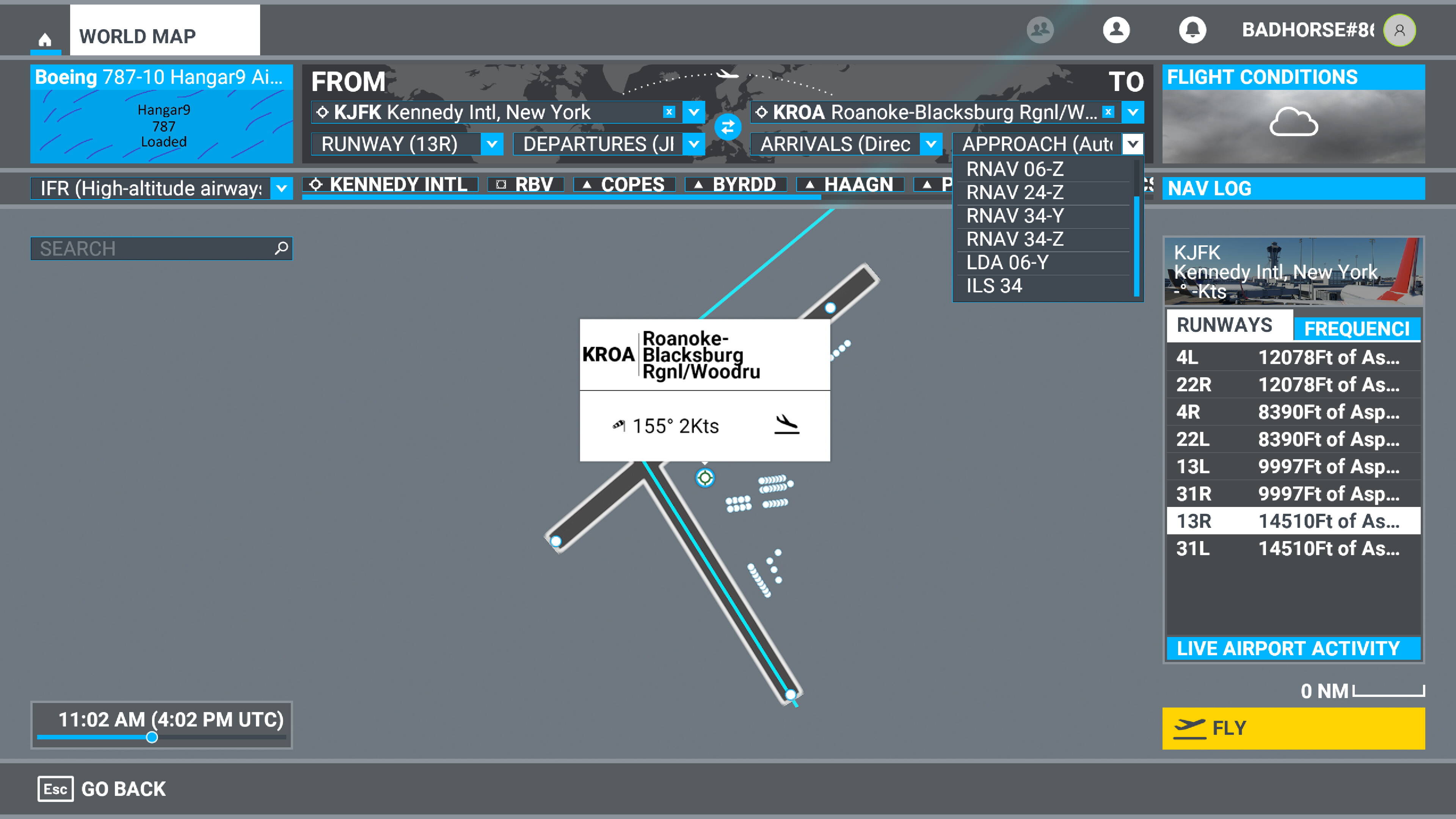
Is there any way to remove the annoying info box when zoomed in on the departure or arrival airports? It’s not like it takes an hour to read and it often covers up gate, ramp or runway selections.
100% agree .. Its so annoying, and so “KIDDIE GAMEY” !!
The whole Flight Planner UI needs a serious overhaul and an updating to be appropriated for a Flight Simulator, as opposed to a kiddie Shoot-It-UP Game.
Maybe, at least move that BIG Label off the airport, and place it in the opposite quadrant to the direction of flight.. – that should be simple enough - and make it just a small Airport Code if zoomed out. – or whatever – at last some reasonable workable “DESIGN” with the needs of the user in mind.
ORIGINAL

.
SUGGESTED

Note: Even FSX did a good job with this, with Aircraft Information Boxe auto positining, on the radar Display, so it’s not a “NEW” Idea.
–
Also, almost equally annoying, is the inability to save the Map settings, to turn on/off Nav info
2 Likes
Yes, just use your mouse wheel to scroll in and the box shouldn’t cover any parking spots. In the rare case it does, you may also select a runway (temporarily) and you should have a good overview of the airport.

Unfortunately that doesn’t always work. It depends on the airport. It seems to be worse the larger the airport. The photo in my post was taken fully zoomed in and as you can see, the box does cover information.
1 Like
Yes, that only work when you are selecting a runway .. when you view the map after your selections, the BOX coves up the airport, and you cannot see details you may need to see.
Just need a little “Design thought” as opposed to being thrown together.
Lol how can a menu be gamey it is a flight sim game anyway.
It’s just a menu has nothing to do with simulating flight.
I do agree that it could probably do with some tweaking here and there.
People need to vote on menu issue’s and make reports to zendesk if they want things changed.
1 Like
Same thing has been mentioned elsewhere today in the forums. I agree. Box should be off to the side when zoomed in then a line drawing from the box to airport center maybe.
Yes, that was me. Someone suggested I repost it here. I hope I didn’t break a forum rule.
It’s kind of funny, there’s all that blank space around the airport, and there always is, and yet, they have to put the text box directly on top of the airport…#justwrong
I guess we do have to remember, they are designing this interface to be compatible with X-box, but, still, there’s no reason to put it there
1 Like
I agree completely. This and many other things seem ‘unfinished’ about this game. Yea I know they are small annoyances and the same ole people will state what a modern marvel this game is, and yes it is great in many ways, but the little things add up and just don’t seem to be in keeping with a triple A title.
They just need some level of transparency for the boxes and some other stuff.
2 Likes
Good suggestion @badhorse8630. If you don’t mind, I moved your post over to the #self-service:wishlist category, so now people can vote on it if desired.
1 Like
Don’t mind at all. Thanks for the help.
Wouldn’t think so. Way to much to read there is bound to be double ups.
Mods can merge Posts if they so choose.
Oh look I should have read the entire post before commenting!
Not sure I explained this correctly in the subject line as I am quite sure it bothers other too.
But this is about the airport description windows that open up when you are creating or after importing a flight plan. They cover the airport view no matter how far you scroll down. It makes it hard to select a parking area to depart from in some cases for instance, and otherwise just blocks sometimes useful information hidden by the display window.
If there is a way to move the box or modify the behavior I have not found it.
AE
In World Map - Create Flight; once you have chosen ‘From’ and ‘To’ airports, the information boxes come up on the map.
Problem:
These boxes are stacked and anchored making it impossible to see the entire bottom box.
Solution:
Good - ‘Make Primary on focus’
Best - ‘Make all boxes Primary’ so they won’t open ‘on’ each other.
The World Map text ribbon is too big!.. It tends to block certain gate positions… especially on smaller airports…
The size of text ribbon displaying the selected runway and or gate position, can be reduced…
OR… Selected gate and or runway can be highlighted, while the information can be displayed in the side panel…
It would be helpful if you could move or remove the airport name box so that it doesn’t overlay or hide the selected approach.
GREAT suggestion.. I’ll try that today, while I kick myself for not having thought of doing that myself 2 years ago !!