Test machine specs: MSI X670E, AMD Ryzen 7 7800X3D, AMD Radeon RX 7900XTX, 48gb RAM
A scenery by Swedish indie developer Marcus Nyberg (overseen and marketed by Orbx), I had been looking at Bromma for a long time prior to finally purchasing in a recent sale. The airport always looked fantastic to me, save for some quite awful ground textures in places I thought they really oughtn’t be. So, do those sub-par ground textures spoil one’s enjoyment of what otherwise looks like a great piece of scenery?
DETAIL
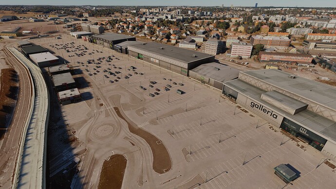
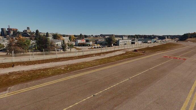
Yes, those ground textures are, as I originally suspected, pretty poor. But I will say, right off the bat, that they’re not as distracting as I thought they’d be. Maybe it’s because the rest of the package is of such sublime quality? Who knows?!
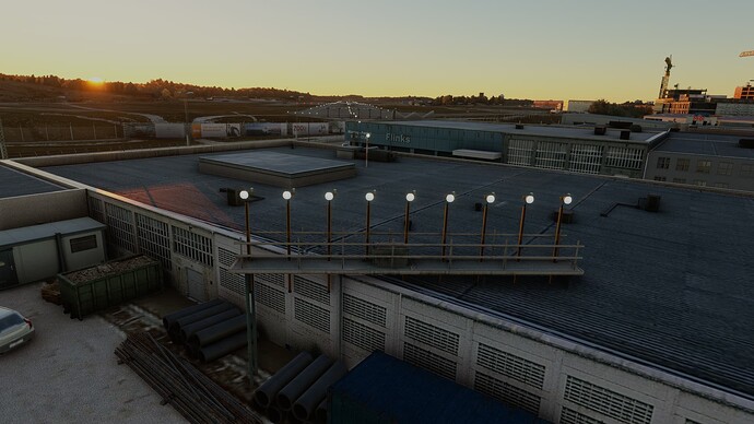
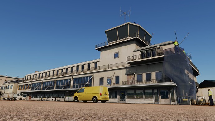
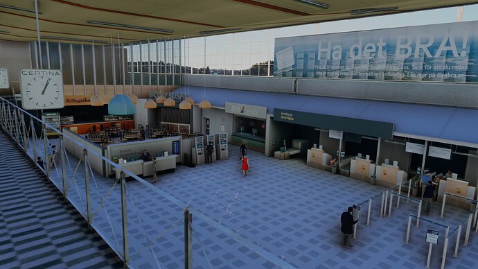
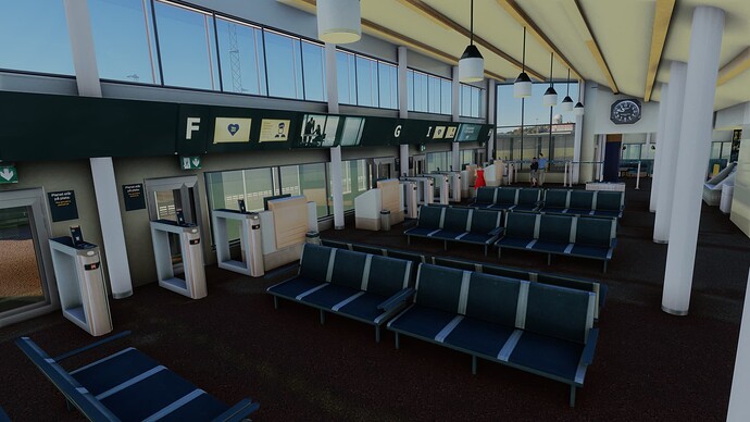
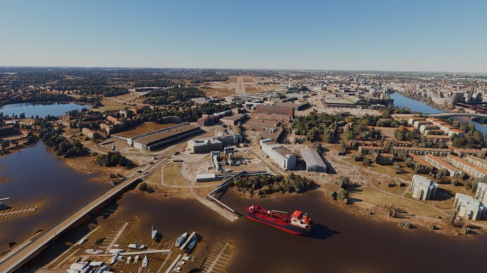
Looking beyond the ground texturing, what we have here is a gorgeously-modelled airport. It even features a terminal interior (main landside concourse and gates), which I believe was added in an update. Everything looks photoreal — a classic hallmark of Marcus’ sceneries. Even the ground textures look reasonable, if you get high enough!
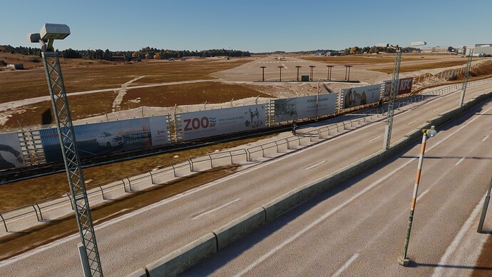
The entire airport looks magnificent. Admittedly, the apron, taxiway and runway markings don’t do the rest of the airport proper justice but they’re not bad — just that most other things are exceptionally good! The terraforming is excellent and you’ll find several taxiways on inclines, requiring thrust adjustments if you want to avoid either coming to an abrupt stop, or coasting downhill at mach one!
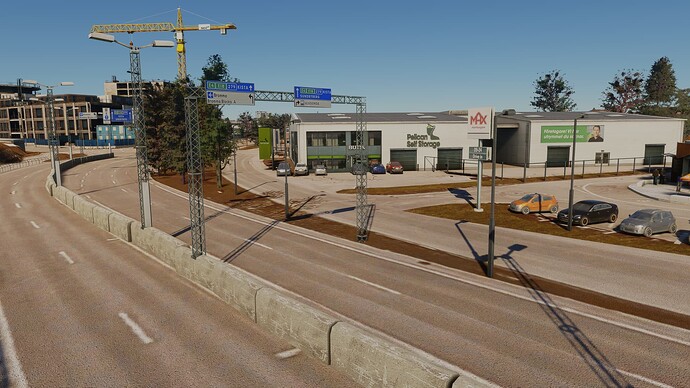
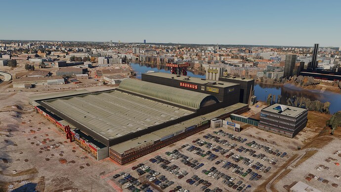
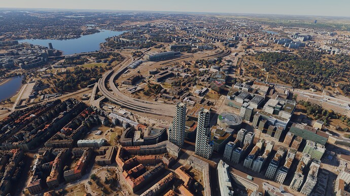
The amount of peripheral detail — finished to the same standard as the main terminal — is very impressive. Immediately surrounding the airport there are retail parks, shops, warehouses, cafés, fast-food restaurants, factories, tramlines, roadsign gantries… and this extends right the way into the city centre! Speaking of the centre, there are a ton of POIs (over 100, according to the marketing blurb) all across the city — even way out in the suburbs! They’re all nicely textured, complete with night-lighting; however despite compatibility fixes for recent City/World Updates, some of these POIs fit rather awkwardly into the new Stockholm photogrammetry. It’s not uncommon to find Marcus’ buildings partially sitting inside their PG counterparts, but to be fair you’re unlikely to notice while flying.
One little niggle I need to mention — and I’m 99.9% sure this is an FSLTL issue — is the appearance of several Brussels Airlines A319s on the ramp. I suspect these are actually supposed to be Braathens examples, which are the only A319s currently based. For some reason, FSLTL is interpreting them as Brussels aircraft.
PERFORMANCE
Virtually flawless, which is surprising given the custom detail and surrounding PG (which is of a very high quality). I suspect the ground textures have been left low-res partly to bolster performance in what should perhaps be quite a resource-intensive area.
VERDICT
Yes, those ground textures are mildly annoying and probably should be better (certainly in the immediate vicinity of the airport, e.g. the terminal landside) but the beauty and scope of everything else makes up for it. It’s one of very few sceneries that manages to constantly draw your attention away from the runway ahead, simply because there’s just so much to look at on the ground! Likewise, it’s very hard to concentrate on the centreline while taxiing to RWY30, due to the sheer amount going on to your left. It feels more real than any other airport I’ve yet seen in the sim. Of course Marcus isn’t entirely responsible for this visual feast since Asobo’s awesome new PG considerably enhances what the Bromma package offers — however it’s all too easy to understate his achievements here. Take away either’s work, and you’d be left with something far less impressive.
In a nutshell, Bromma is a package that every MSFS user should own. It really is that unique. Granted, the relatively poor ground texturing is quite a drawback but it’s not actually as bad as it looks in the marketing images. Besides, your eyes will very quickly become too busy looking at all the eye candy to really care!
This is a perfect example of an accidental collaboration working almost flawlessly. Marcus’ exceptional photoreal modelling meets Asobo’s outstanding new PG… and the result is a big win for the end user!
I picked this scenery up in a sale but it’s definitely worth its full asking price. I’d say it’s the most detailed, aesthetically pleasing approach in the sim… and the taxi to RWY30 ain’t half bad, either!
IMAGES

