With the increasing number of Planes for MSFS, and some Developers making the same planes, it is becoming increasingly difficult to find and select the desired plane for the high number of planes displayed when making a visual selection.
Adding text, denoting the Developer and Plane Type to the Thumbnail’s Image would greatly help (even if Asobo does not set a good example !!)
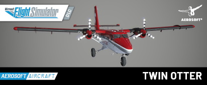
Good Example: Aerosoft
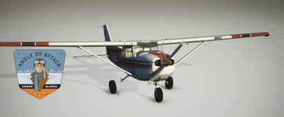
Somewhat Good Example :
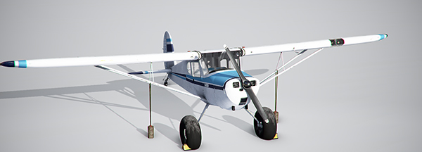
BAD Example (No names Mentioned)
No info, and file size not even the standard thumbnail size
It’s those little things, and care to Details that make all the difference.
I think there’s a requirement for the marketplace for all thumbnails to look exactly like the default ones, same poor front angle shot where you can’t see most the plane and no extra details added. Of course there’s no such requirement for planes sold outside of the marketplace but I’m guessing most devs just want to keep them mostly the same.
I remember the Jabirus used to have a little icon showing if the plane livery you selected used GPS or analogue gauges but for the marketplace the dev had to remove them.
IMHO, that’s just plain LAME !! ----- but now I look, I see that its appears to be true
Rather than making these restrictive rules, it might be better if Asobo followed the rules themselves, and at least put an Image of their Planes, to show up in Content manager, rather than the same boring MSFS TEXT Logo.
What are they worried about – some MarketPlace Dev is going to put a NAUGHTY WORD or IMAGE in the plane’s Thumbnail ?? and if any were stupid enough to do that, and it would not be noticed when their Product was submitted for store application. ?
It has always struck me as Lazy & Sloppy that so much of the Asobo content in “Content Manager” does not have a relevant Thumbnail, and now that they have started doing it with later content, it looks even worse when older content has not been updated to be consistent.