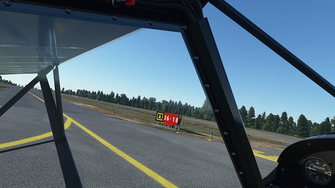
I’m not sure how they do what they do but they should not be scaling them for “users”. With all the potential variations, it’s a fool’s game. Size them appropriately and let the users sort it out. That’s why we have the ability to change our resolution and zoom factors.
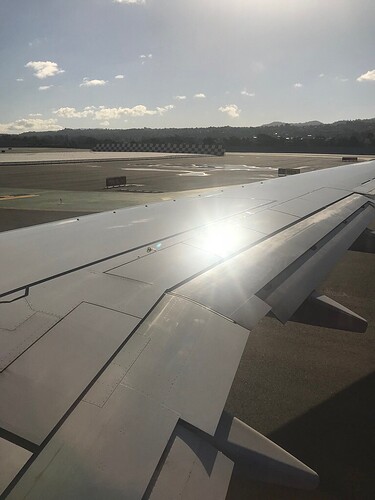
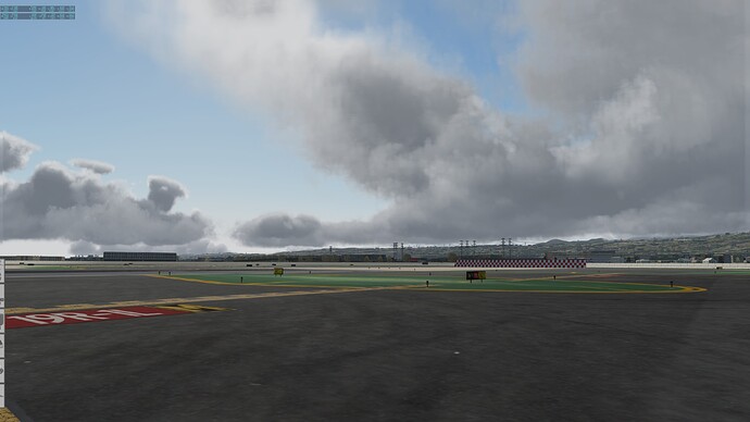
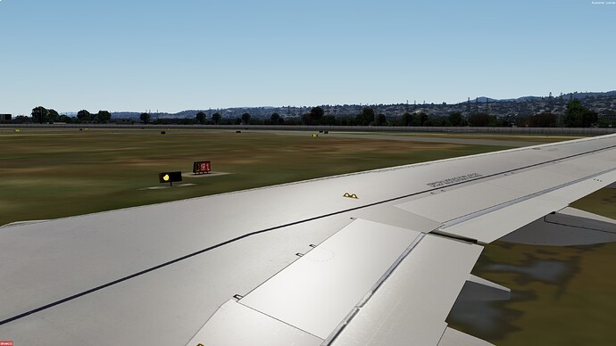
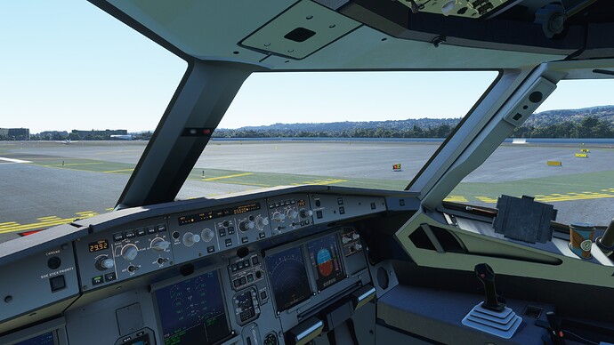
Here are a few shots comparing nearly the same location at KSFO using a real-world image, then images in X-Plane, P3D, and MSFS. As mentioned earlier, we should be aiming for 1. accuracy - All are inaccurate to the real signage to some degree or another, and 2, size them as specified. You decide but they shouldn’t look like the last shot at Anacortes. The more appropriately sized sign is hidden behind it’s oversized duplicate. Readable doesn’t make it right.
SFO Actual image:
X-Plane:
P3D:
MSFS:
Anacortes:
