The taxiway signs are finally readable in game. I could not use the taxiway signs before on VATSIM because the letters were too small. Now, the taxiway signs are readable and I can use them in VATSIM.
The taxiway letters were also nice and large in FSX too. The difference is, in FSX, there was less padding around the taxiway letters, so because of the reduced padding around the letters in FSX, the taxiway signs were a little smaller:
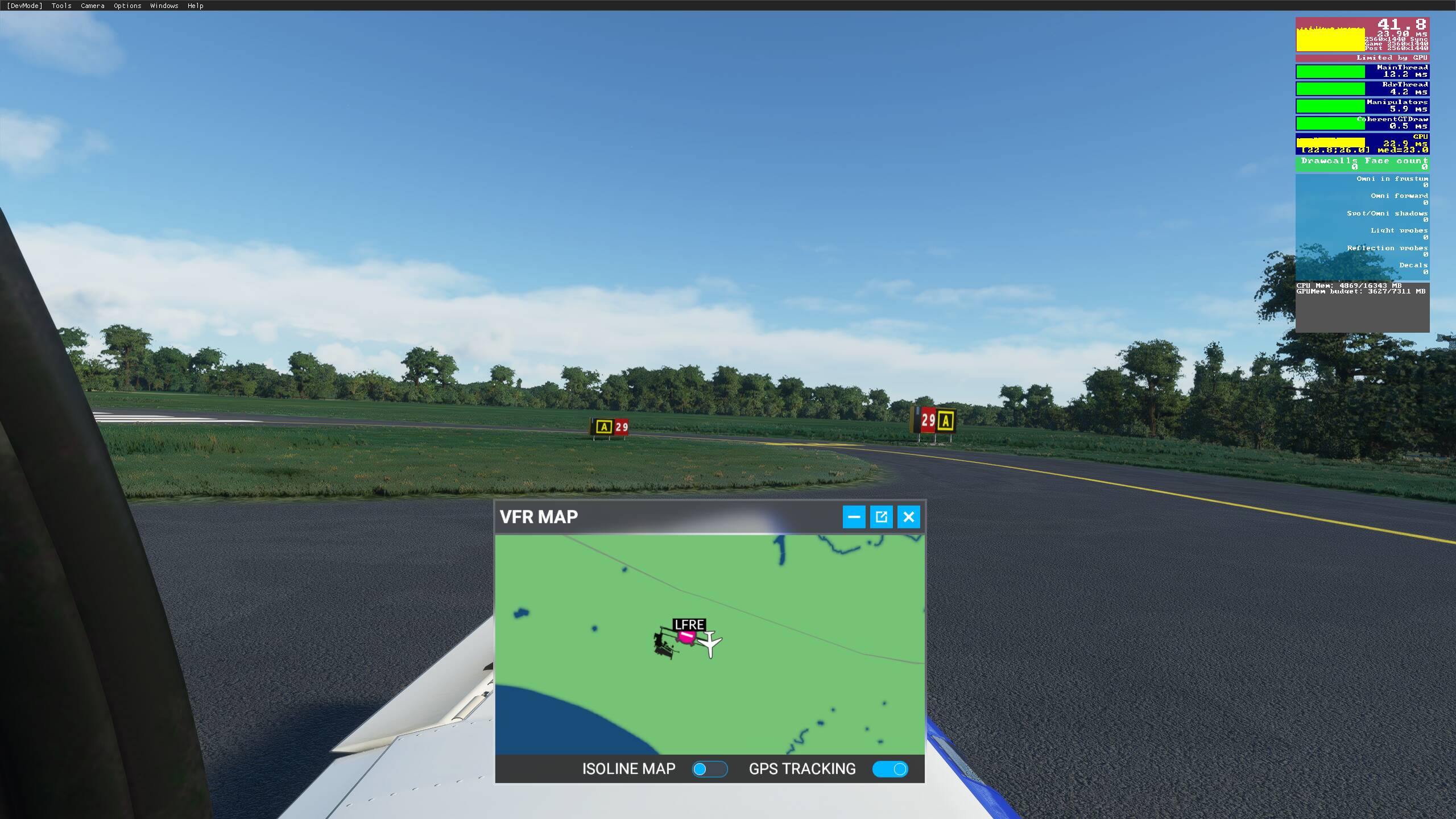
However, what matters the most is the size of the letters. Now, the letters in the taxiway signs in MSFS are about the same size as the letters in FSX. So the taxiway signs are finally useable for me in MSFS for VATSIM:
You can see the size of the letters is about the same now in FSX and MSFS. The difference is, there is less padding around the letters in FSX, so the taxiway signs are smaller (but without the padding in FSX, the signs are also uglier and less realistic).
People need to realize that because the world is 3D in MSFS, you can’t read a taxiway sign from 20 feet away in MSFS, but in real life, you can read a taxiway sign from 20 feet away. So the only solution is to make the taxiway signs bigger so the letters are bigger (the other alternative is to go the FSX route where the letters are big, but remove the padding around the letters to keep the taxiway signs smaller).
Something I don’t think I fully appreciated til I looked at that image is how the signs are not symmetrical. By that I mean the back of the sign has some slopes, or tapering at the top, and bottom.
I had assumed that the signage not having text on the back, and front, denoting a taxiway on one side, and runway on the other, for example, was merely a bug, and not a deliberate design choice.
This is so insanely useful in VR! I don’t even care if the signs might not be realistically sized, what matters is that I can read them. This change is bigger for me than the whole UK thing
Only downside, as stated by someone else earlier, is that they still glow way too bright at night and that washes out the lettering completely. But that’s a niggle that I’m not going to let get in the way of the joy I felt first time I saw this in VR!
They might be readable now, but still the designators are wrong at most airports - won’t help much on VATSIM if you were given the instruction to taxi via L5, S1 when your signs just say A and B.
For CVYR, the taxiway signs are marked correctly when I zoom in. So it will help me immensely in VATSIM. Getting the size of the text correct is the first step. The next step is probably one of the suggested wishlist items where the community can correct the taxiway sign letters and numbers. When Asobo implements that feature that allows the community to correct the letter and numbers of taxiway signs, then we will have a comprehensive solution.
Not really. The left sign that is smaller is just readable. JUST readable. If the left sign is any smaller, I would need a magnifying glass to see the letters. In the previous version of MSFS, the left sign would be unreadable.
Your picture is 2560 x 1440. I assume you are using a 25 inch monitor or larger.
I am using a 22 inch monitor and my resolution is 1920 x 1080. On my monitor, when your picture is downsized to my resolution, the left taxiway sign is just readable. JUST.
So you cannot assume everybody has the same monitor size and resolution as you. Since I am using a 22 inch monitor with 1920 x 1080 resolution, I know that some people are playing MSFS on their laptops. Many laptop have a 15 inch monitor. If the left taxiway sign is barely readable for me on my 22 inch monitor, it’s probably not readable on a 15 inch laptop monitor.
So you cannot assume everyone has your monitor and resolution. Asobo needs to account for laptop users as well. And since my monitor is 22 inch and 1920 x 1080 resolution and I am already telling you the left taxiway sign is barely readable, it’s most likely unreadable by laptop users.
Thanks Asobo! Been waiting for this issue to get fixed.
Now it seems the new signs are a little bit too big depending on the size. What we really need is this:
The lettering needs to be fixed to better match the real world, and the font size within the sign needs to be increased. The sign sizes need to be decreased to fit real world dimensions.
They’re way better than they were for sure, but now they seem a bit unrealistically large. I think Asobo might’ve inadvertently messed with the sign size before realizing that all signs were stuck at size 1 no matter the airport…
If you all can, please check out and upvote these threads!
Now we can read the signs. That’s a nice improvement. Now if the signs can be labelled accurately as per the real world so we can use real charts to navigate airports, that would be amazing.
So is it now too big or just right? I worry this is one of those things where putting something on a screen in real size makes it actually unreadable, and we’d end up with a tug of war between the “make it realistic” and “make it legible”
The left sign is a realistic size though. The issue is the size of the letters, the font, and the glare. The letters are too small within the sign face, and the font is unrealistic and harder to read from afar than the real font. The sign on the right looks to be more than 6 feet tall… in reality, the largest sign size should be 4.16 ft tall.
What they did is fix an issue where all signs at are automatically set to size 1 no matter what. They fixed that bug, so now taxiway signs will actually show as the size the developer chose (size 1, 2, 3, 4, or 5). Size 4 is the largest size though, and IRL, it should have a height of 4.167 feet. In the sim it looks monstrously bigger. There are a lot of issues. For now, I’m just happy they’re legible.
The scenery gateway system is in development and will be coming sometime in 2021. This will help significantly. Asobo and Orbx have also been updating airports across the globe’s taxiway names in the meantime. Most international airports at this point should have realistic names. Can’t wait for the scenery gateway system to get here though.
Indeed. It will be nice to have correct taxiway labels.
I fly GA pretty much exclusively, so I don’t spend a whole lot of time at large international airports. However, I’ve noticed improvements over the last months. Airports that were previously impossible to navigate with a chart now match up. That gets a big thumbs up.
But smaller regional and municipal airports, which sometimes can also have some pretty complex taxiways, are still not labelled correctly in many cases. Hopefully in time this gets resolved.