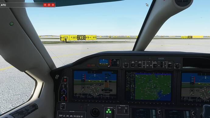
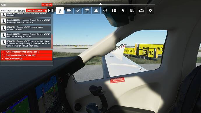
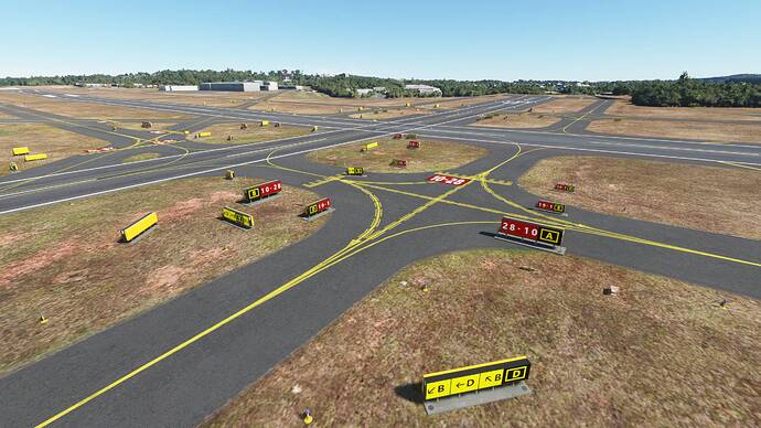
Oh come on- is this seriously the new normal now, huge taxiway signs? On top of broken taxiway lighting and server issues? What’s next?
Size always matters.
Holy patooters! That’s vastly oversized isn’t it? The largest size of a sign is about 1.3m high, a quick google search shows a Cessna 172 is 2.7m high (at the tail).
Your are mixing resolution and size. The size of the sign is too large. Has the same height as the Robin DR400 which I was flying. And that is completely unrealistic.
That doesn’t mean they can make signs like the left one or a little bigger, and a bigger font. But there is a bug with the size of some signs. As @RWIP66 shot also shows.
Load a flight in LFRE and look it by yourself.
I think you are the one that is confused. I know the taxiway signs are bigger in this patch but that is fine because a lot of people can’t read the taxiway signs in the previous version. I’m telling you that just because you can read the taxiway signs because you have a bigger monitor and a higher resolution, that doesn’t mean people with a smaller monitor and lower resolution can read the taxiway signs.
For people like me who have a 22 inch monitor and use 1920 x 1080 resolution, I am happy that Asobo made the taxiway signs larger, even if it doesn’t perfectly correlate with the size of taxiway signs in real life, because the old taxiway signs had letters that were too small and were unreadable.
Again, you need to realize that this is a 3D simulator and not real life. Because it is a 3D simulator, and because everything is generated in pixels, you may be able to read the taxiway signs from 20 feet away in real life, but you cannot read the older taxiway signs from 20 feet in the simulator. And the monitor size and resolution is also a factor for readability, which you don’t seem to understand.
Maybe a smart idea would to tie the size of the taxiway signs into the accessibility settings, for people who need to increased legibility.
This issue I don’t think can be handled with a one size fits all solution.
I started a session at KIAH to check out the sign sizes. I was hoping the signs were readable, but I wasn’t expecting this.
I’m glad I can read the signs now, but these look like billboards to me. And in the shot where many signs are visible, the signs almost wipe out the view of the airport.
The worst problem to me is the intersection of signs that are near one another.
I can get used to the other issues, but I hope this will be addressed somewhere down the line.
Asobo can also implement a slider for the taxiway signs in the Settings, so we can control how large it is. For people running smaller monitors and lower resolution, we need the taxiway signs to be bigger. If you have a 40 inch monitor and you are running in 4K resolution, you probably don’t need the taxiway signs to be as large.
Should their size reflect reality, rather than the size of your monitor?
Would have been alot better to have included an option for taxiway sign size. They too big now but i understand why some people would want or need that.
hahahq 


tooooooo big
So if people can’t read the taxiway signs, what’s the point of them then? They are effectively an ornament in the flight simulator if you can’t read them.
Ornaments are for Christmas trees. I prefer my taxiway signs to be readable (ie. for VATSIM), even if the simulator taxiway signs are larger than real life taxiway signs.
Yes, a slider for us to set the size in Settings is the optimal solution. Then people can choose how big they want it, or if they want to keep it as small as the pre-patch size.
Without a slider though, I am fine with the size of the taxiway signs as they are now in this patch, because at least I can read it for VATSIM.
I mean this seems like a workable temporary solution, but holy cow they are big!
Many add on developers have managed legible taxiway signs without them looking ridiculously oversized like this. Lets hope they find a proper solution long term…
Can’t really argue with that. If you had a choice between unrealistic sized signage, and unrealistic almost anything else, sacrifice the signs.
Still blurry for me. What VR headset are you using? I have the Oculus Rift S.
So we expect a Cessna to be sized like a Cessna. A tree to be sized appropriately for a tree, and buildings to be sized appropriately.
Why not then the same for taxiway signage? It’s the one thing other than aircraft dimensions that are standardized. Why not make them so? Should we have to get fancy with sizes and have people talking about monitor sizes, resolution, whatever? That’s on the user. Do two things please:
- Make them accurate.
- Size them as specified.
I don’t recall any issues ever in P3D or X-Plane regarding the “visibility” of airport signage unless it was an issue introduced by a third-party scenery add-on.
This. Yes, clearly a mistake somewhere?
So I already posted a picture of FSX taxiway signs in the first post. FSX taxiway signs are also readable because they reduced the padding around the letters. The size of the letters for MSFS is comparable to the size of the letters in FSX.
Do you like the FSX taxiway signs? Because the FSX taxiway signs, with the reduced padding around the letters, are actually less realistic looking (there is more padding around the letters in real life). But the FSX signs, size wise, are probably a little smaller than the MSFS taxiway signs now (because there is little padding around the letters in FSX).


