If you’re like me and don’t want to pay for a Navigraph charts subscription there’s of course Skyvector with almost all charts you’d ever need when flying in the US. Charts for Europe however are harder to come by, but I’ve found a way to access the official Eurocontrol charts:
- Goto: EAD Basic - EUROCONTROL
- Signup: you can fill in bogus information, so you don’t need to have an actual pilot license
- Verify your account through the email you’ll receive
- Login
- Goto AIP Library (menu on top)
- And then search for the airport/sid/star/rnav/ils you want, for example:
And there you go… Not as good as those Jeppesen charts, but I don’t mind.
Those are not so good though as there is a lack of standardisation between countries, every memberstate has their own layout. I wouldn’t use those even for free.
1 Like
The differences between charts really don’t seem that great to me.
Sure it might look a little different but it’s the same data presented in largely the same way.
Have you got any examples of charts that are so radically different as to be unusable ?
I personally prefer and would really recommend chartfox.org - mentioned above as well. Works like a charm and looks more user-friendly than the Eurocontrol site.
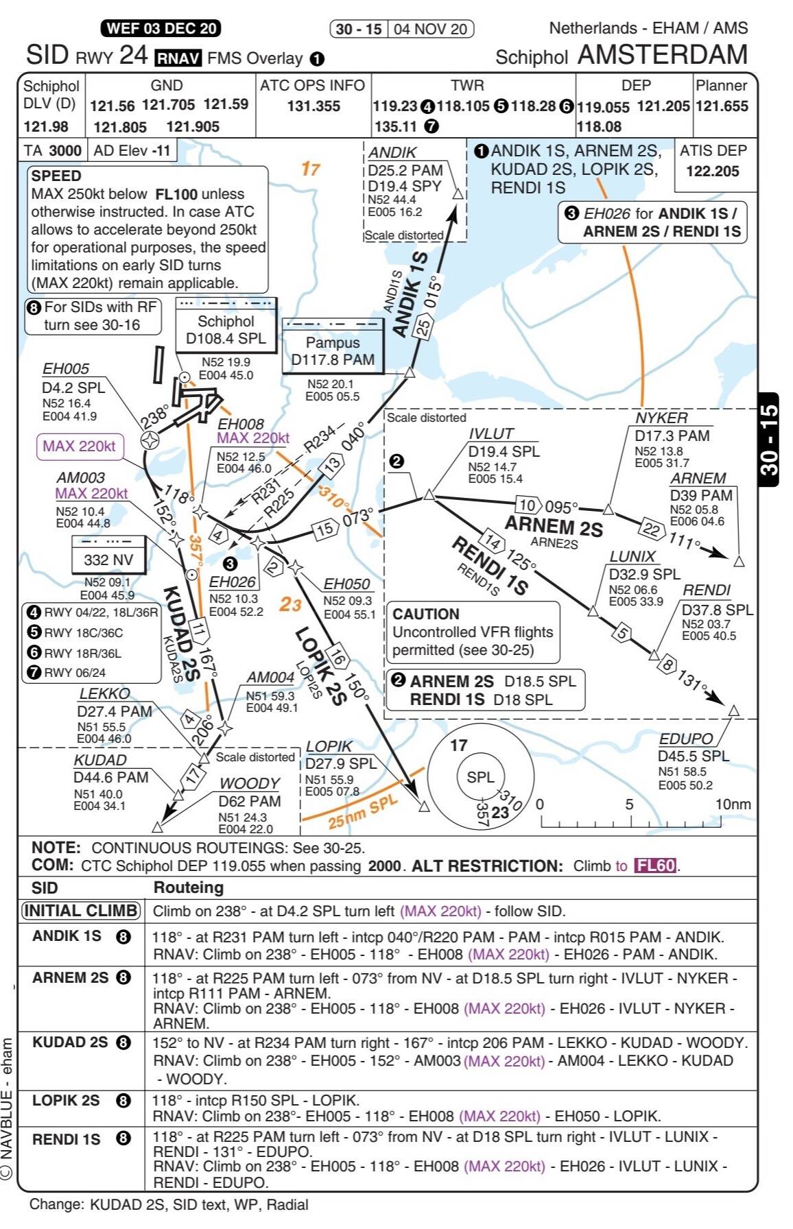
They are probably not unuseable, just impractical. Last time I’ve checked, the departure and arrival routes for Schiphol were on one chart per runway which needed to be used together with the AIP text part in order to make sense of it. In other words, the charts, except from graphically showing the route, contain no further detail. Example:
That’s just one of many examples, we were required to work with those charts for radiotelephony instruction, most students couldn’t make sense from it on the ground, let alone in flight. I hope we will get NavBlue Charts+ (formerly known as Navtech) in MSFS soon, those are a hundred times better than Jeppesen or those AIP charts.
Honestly that seems pretty normal for a SID chart except it’s combining multiple routes onto a single chart, certainly what I expect to see for departure info is there.
Not really, communications, noise abatement procedures, altitude and speed restrictions, climb gradients. It basically shows the route and nothing else, to really fly this departure properly a lot is missing which you need to look up in the AIP text section. Combining multiple routes for the same runway is quite normal, NavBlue is also doing that.
I guess I’m used to the Jeppesen chart data where just like Eurocontrol that data is usually separate as well.
The information is no different between NavBlue and Jeppesen. There might be slight differences, but with both Jeppesen and NavBlue you generally have all the information you need to fly the departure while with the AIP charts you only have the route (only the waypoints, no detailed explanation, lead-radials etc.), MSA, initial altitude and transition altitude and need to look up the rest in the AIP text.
The only thing I can actually see missing from the Eurocontrol chart is the textual description of the SID ?
Really? Communications after departure is missing, speed restrictions are nowhere to be seen, the textual description is essential for flying the departure correctly. When flying RNAV you might get away with just the waypoint sequence and whether those are fly-by or fly-over points, still speed restrictions on the departure are important. You can’t fly the SID conventionally using the AIP charts, details like lead-radials, DME distances etc. essential for flying a conventional departure are missing.
Speed is there - Max 220KIAS
Departure comms is specified at the bottom.
As for textual description couldn’t you literally write that on the cart or board ?
The frequencies yes, not the procedure (Its required to remain on tower frequency until passing 2000 ft), which frequency of the two? You could write it on a piece of paper if you want to go through the whole AIP every flight, sure. But then you wouldn’t need any charts  . You could just as well write down the whole SID on a piece of paper, the pretty top down view is just an extra, I can do without, hence my comment that those AIP charts are not that usefull…
I guess if hundreds of lives depend on this then it’s a different matter (though presumably the EASA thinks these charts have appropriate information on them ?) but that’s not the case for me or the VAST majority of people in here so I guess it’s a different perspective
Personally the charts seems just fine for MSFS at no cost so I certainly don’t agree with your “wouldn’t use those even for free” statement.
Well, its an opinion, I personally wouldn’t use them. If I fly in MSFS I fly as true to life as possible and for that purpose those charts simply aren’t up to the job. If realism is what you are looking for then you kind of need either NavBlue or Jeppesen. People just punching a RNAV departure into the FMS without crosscheck don’t need any charts at all.
I don’t know any airline using AIP charts and I doubt the respective CAA would approve. I have worked as ground and flight ops manager in a regional airline so I know the requirements for these kind of services.
Hopefully we get Charts+ in some form in MSFS so we don’t need to revert to AIP charts or subscribe for something. Guess those charts won’t be completely up to date but I can live with that.
Considering the gaps we already see in the Navblue AIRAC data I don’t know how comprehensive any Chart solution from them would be.
Not sure, it probably works quite well for Europe, I’m using NavBlue for years in the real world and it works excellent. I also haven’t seen much problems with AIRAC data in sim, at least in Europe?
1 Like
The data seems fine for large fields but MSFS is definitely missing approaches at smaller fields like my local EGBK which is present in the Navigraph AIRAC data.
That said I have no real way of knowing if the data isn’t there in NavBlue or if MSFS isn’t exposing it for some reason - though conversations with Working Title team members on another forum suggest they believe MSFS is making everything available that they can.
(To that extent it would be interesting to know what’s in the base NavBlue data rather than the filtered version we see in MSFS but I can’t see a way of ever getting that raw data)
Nice to see some friendly opinions 
If I were a real pilot I’d just subscribe to Foreflight (Jeppesen) and be done with it. The subscription cost is nothing compared to the cost of flying. But for simming it’s just not worth it to me. Even though I could easily afford it, it just doesn’t feel right.
MS adding charts in-game would be absolutely fantastic. But I’m not counting on it.
It’s a bit strange that a simulation has this entire world of procedures under the hood (through the AIRAC data), but then they’re not visible unless you subscribe to a third-party service. They should be provided in some way in the game itself, like autogenerated based on the AIRAC data. Real-world charts would still have the edge, but at least something useable would be in-game.