Hey guys i am quite curious as this topic isn’t discussed much but i hear complaints about it now & then from several discord channels.
I personally think it’s very off from a real image in terms of color balancing, saturation etc.
Grass is way too green, i am simming not playing zelda breath of the wild…
Clouds tend to be warm with a very little amount of red in there, often looks too grey but never truly white.
The blues are also oversaturated overall, even at high altitude it should shift a bit more to grey.
there are many more points (in my opinion) that are not correct.
but i am curious what you guys think as fellow simmers. If you are a real pilot and are willing to share shots of how it should look like it would be appreciated
this is in no way a post to bash Asobo, i just want to hear opinions of my fellow simmers on this subject.
so if you want to just vent like a child, please find a different post (no offence)
Yes, indeed, the colors in the sim requre much correction… I also noticed that the ground color is too green. Also, I am not happy with the day light. In the evenings the sim looks great. But during day time the picture overboard is not pleasant at all…
I wouldn’t say everything is okay myself.
Everyone is entitled to their opinions offcourse, that’s why i started this thread to see what others think.
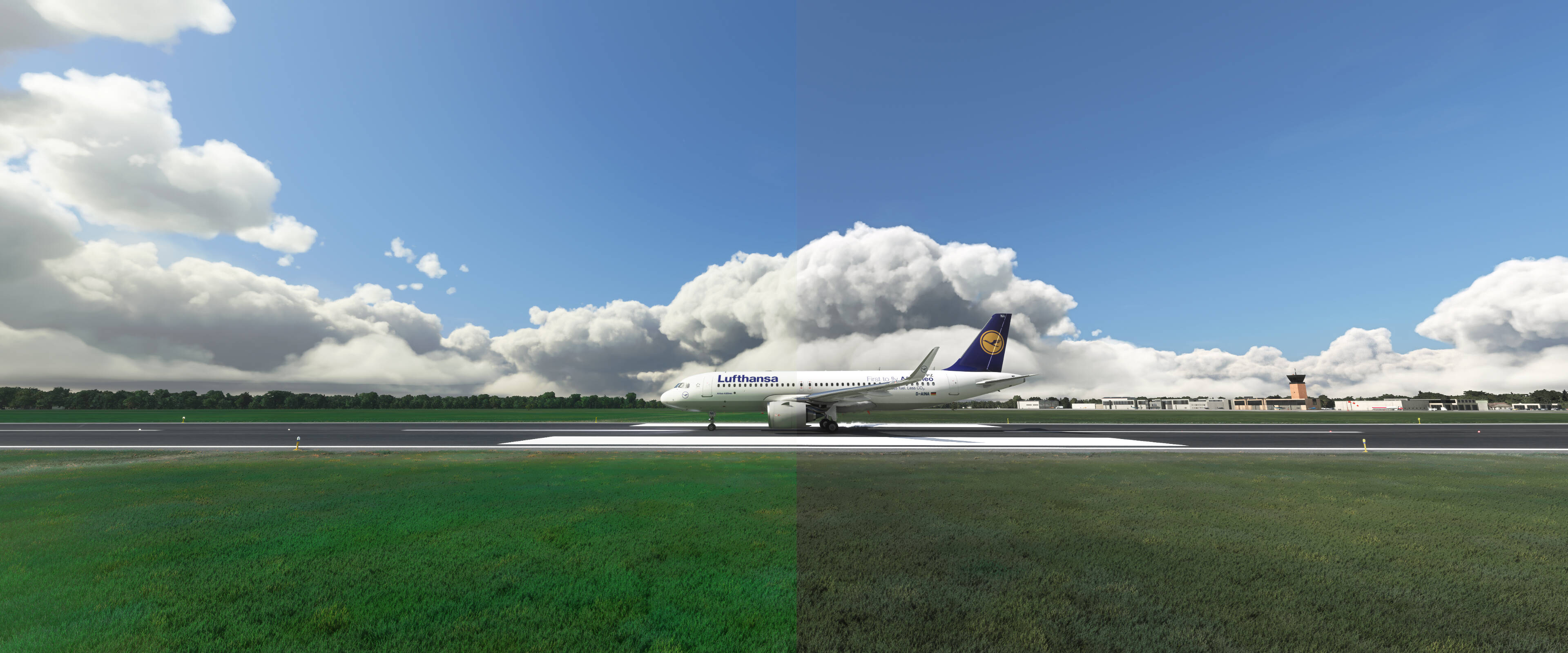
I tried correcting colors in reshade but there is so much it can do, and it does it globally unfortunately.
Left side is MSFS, right side is Reshade
I tried correcting it a little bit, can’t get favorable results yet.
Really hope Asobo revisits the color grading of the sim when it comes to balancing.
Maybe collect alot of samples from real shots and start from there.
IMO definitely looks a bit washed out now and something about the trees in the distance looks a little grainy to me also. I use a 4k HDR tv if that makes a difference. I have tried some color correction with NVCP but have not been able to get it back to the way it was pre SU5
There is already a request for color adjustment here. Please go and vote.
We need the ability to adjust colorspace, not just ask for it to be ‘fixed’, because we perceive it differently and are using a wide range of different types of screens etc.
I find the ground colors very bland and undersaturated compared to real world from altitude. I also find the vegetation is (for the most part) too blue. I’ve used an image editing package to adjust your screenshot in the lower left corner. This looks way more natural to me. I used a tone map adjustment to move blue to yellow (particularly in highlights) and then desaturated a bit. Desert textures mostly seem to be okay.
I think it depends on the place in the world you are flying and on the time of day, time of year and weather.
For example in Austia and Southern Germany I find the colors mostly very pleasant in spring and summer and in the sunshine. However, since the light in winter is quite different, which MSFS manages to simulate only to a degree, and since vegetation looks completely different in winter, I think the colours are to green in winter. Also during very bad weather in summer, this dreary bad weather vibe doesn’t work as well as in real life
Another example is the Canary Islands.
They doesn’t work very well, because all the Bing aerials are much too green and brown. All the areas where you can see volcanic material - that in real life (depending on age) is black, dark grey or oxidised brown - looks completely wrong. This is especially noticable on the Southern part of La Palma, around Mt. Teide in Tenerife and especially Lanzarote.
There’s a set of aerials available for the Canaries but they are about 10,-€ each for every island and that’s too rich for me.
HOWEVER:
I do not think this is too much of a dealbreaker. This is more or less cosmetics and I don’t really fuss about it. After all as I stated above the way it looks to the naked eye changes with weather and season anyway, and if the Canary Islands really are to green for me, I just pretend it’s the tint of the cockpit window in combination with my sunglasses
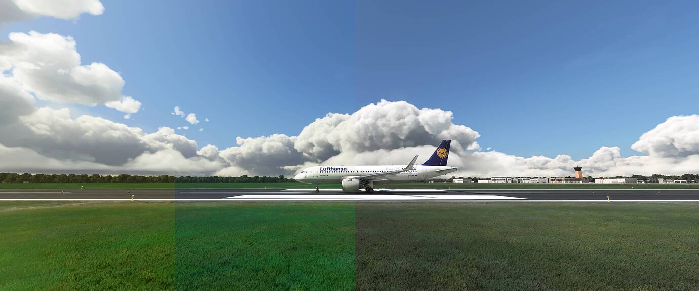
That’s one of the points I was trying to make: left side looks like spring or summer (without a draught), right side looks like winter.
The thing is like others above said, it changes per region and season.
But it looks incredibly off the way it is vanilla at this moment.
My reshade isn’t perfect but it represents colors a bit more natural for the netherlands where i am.
Maybe it should be a bit more vibrant in that setting tho.
I’m sure Asobo is smart enough to tackle this issue and work out a proper fix.
Just tested. Can’t agree, but I’m pretty sure that the monitor and monitor settings are playing a signifcant role.
I’m using a high quality RGB calibrated monitor.
I am a designer, i have a calibrated 4k IPS panel.
but it’s obvious that for you it seems fine as it is, that’s your opinion and i respect that.
quite alot of people including myself find it to be off.
yes it looks more realistic than XP/P3D etc, but that’s not a standard hehe.