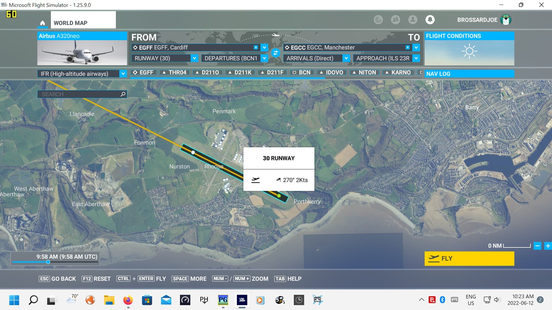
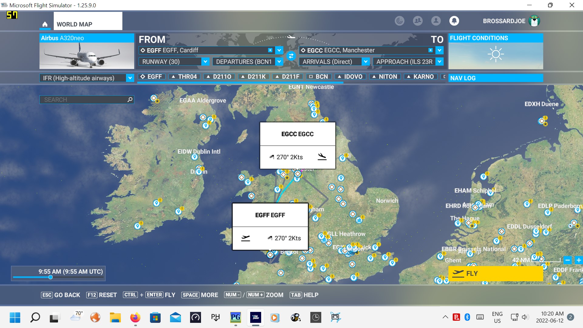
My first screenshot shows a Departure airport’s runway and its big white marker. It’s big, indeed. In whole plan view, per 2nd screenshot, the markers are the same size and they hide the plan’s arrival details.
Is there a way to edit the World Map in order to change the markers’ size or their details? I understand it’s nice to have the wind information but it makes the markers larger than I find comfortable as I prepare my FP. Any ideas about this would be helpful.
Totally agree with this. Actually the entire UI is big loud and clunky. It is the most clunky unwieldy menu I have ever seen in a game. Remember how modders fixed Skyrims clunky menu and optimized it for PC? This is what we need.
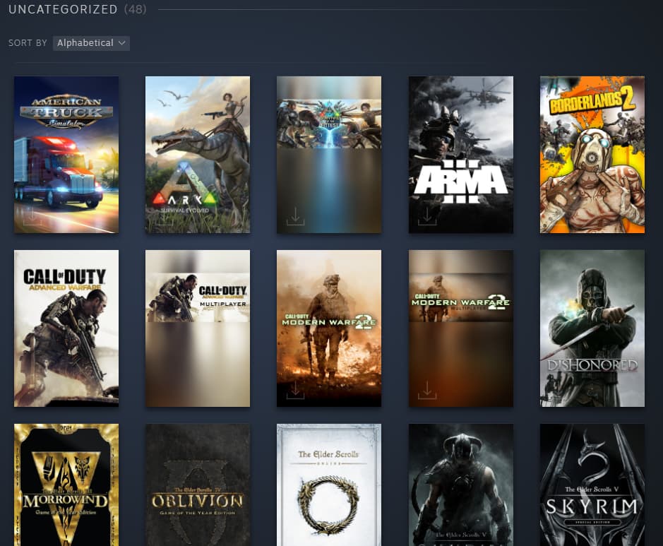
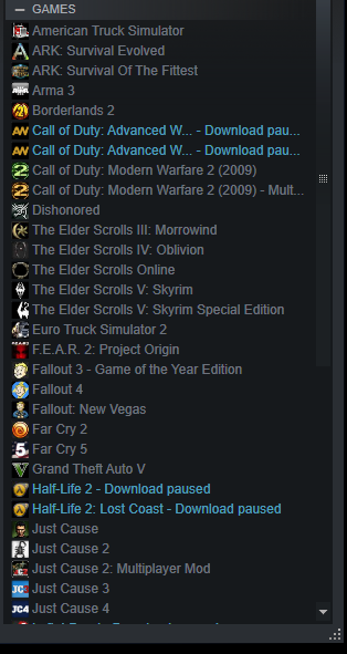
Another good example is Steam. They have a regular view and a Big Picture Mode. Furthermore you can view your games via huge tiles (like MSFS) smaller tiles or as a list.
They need to give us a version where we can just view a neat list of airplanes/scenery/content manager without the massive cartoon pictures.
They optimized the menu for a living room experience where theres a giant TV across the room and people are lounging on a couch. For that its fine.
The massive map labels the size of the moon obscure details and we have to zoom right in to see stuff they overlay.
Heres hoping that one day they give us a sharp and responsive UI optimized for desktop use.
Thanks for this, Vincent. I had a quick look at the mod and I see Frankfurt on Main still has that big marker. I agree the transparency makes a difference but I don’t think it’s sufficient. I’ll have to explore that offering further, though, it looks interesting. I hadn’t seen it yet.
Hello, I’m sorry to say I don’t know Skyrims. Or Steam, for that matter, and I may be missing something.
When Aces’ studio closed, I gradually let go of FSX as there did not seem to be a lot happening anymore and I became interested in other pursuits. I never tried the other flight simulations that were on offer, I’m not sure why. Yet, on 18 August 2020, I flew the new MSFS and haven’t looked back since, problems and what not. It’s so beautiful.
I agree interacting with the sim is a wee bit clunky but I don’t want to rock the boat too much; I just don’t want this fantastic simulation to go away.
This is the option I feel MSFS should have in its menu system. I stress that it must be an option because everyones different and other gamers like the big tiles of the current menu.