Hey there,
first of all, thanks to the team at GAYA for creating the probably best rendition of Munich airport we´ve ever had for any sim to date. However I´ve noticed a few things, some being bugs, some just suggestions for making the airport even better. There´s gonna be a few screenshots with it so I´m already sorry for the little lengthy post.
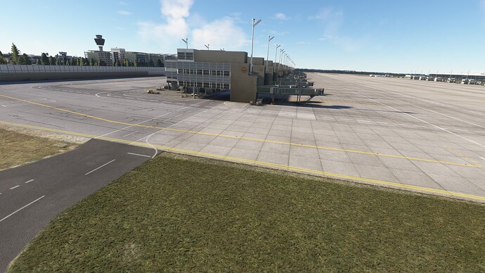
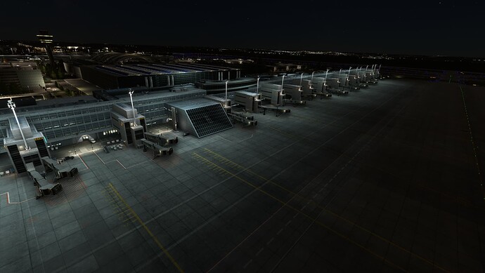
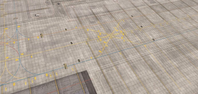
First thing I noted was that at least the Terminal 2 building quickly starts losing its quality which makes it look like shown in the screenshot. Also, another note there, I personally find the Terminal 2 main building to look a notch too dirty. It´s almost grey. Irl it´s a little dirty, but still considered white I guess… but that´s my personal pov so maybe others could (dis)confirm.
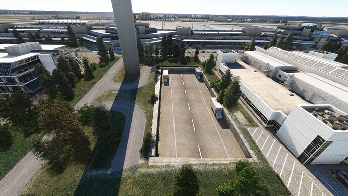
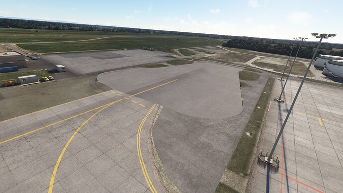
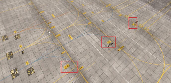
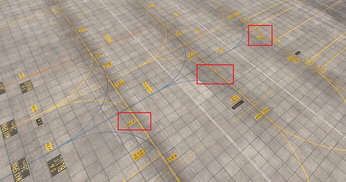
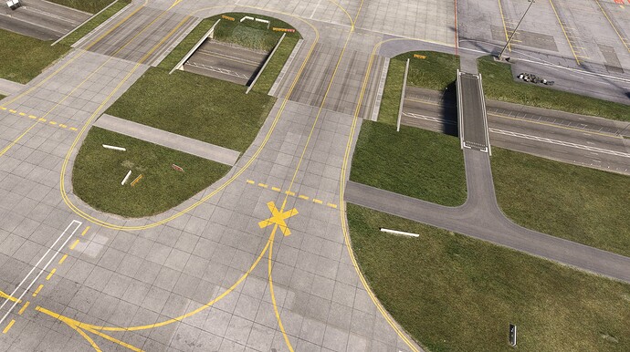
Second one next up. Seems like you´ve spent quite some time on the area between the two terminals. However I don´t know if that´s supposed to look like that. At least and for sure, it´s far from being realistic.
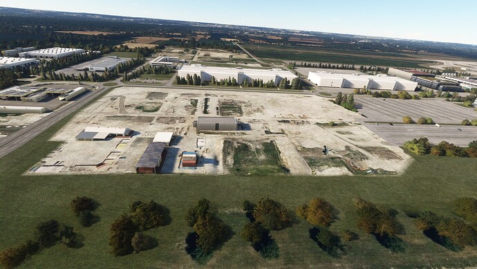
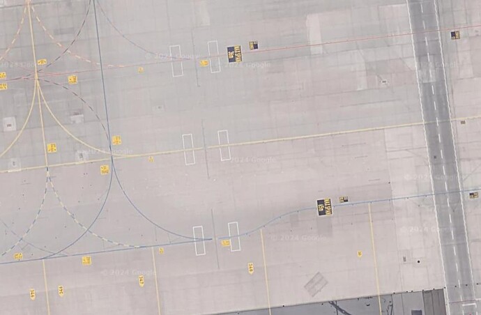
Well… something I already pointed out in the Facebook comment section when you announced WU18 there. Nice that you included the construction site, however, they´ve come pretty far and your rendition is really really outdated, even though the pier is not yet finished and it also makes the apron look ■■■■ empty.
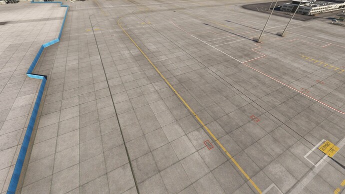
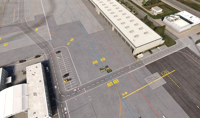
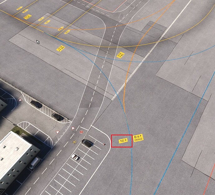
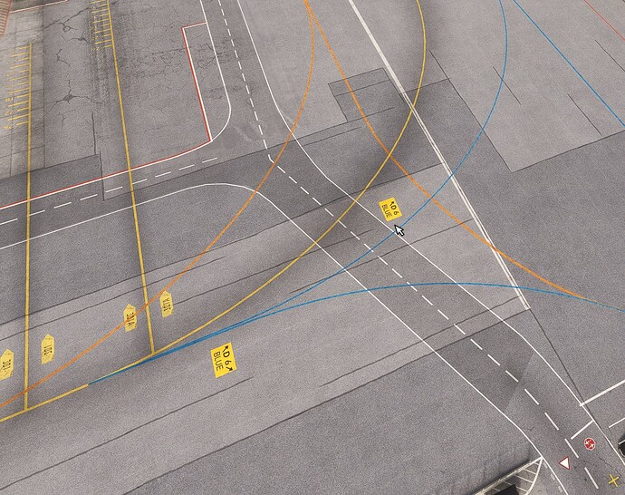
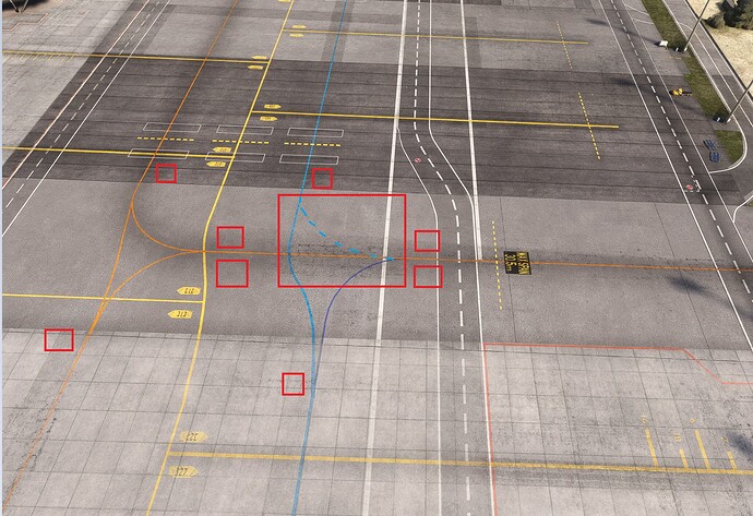
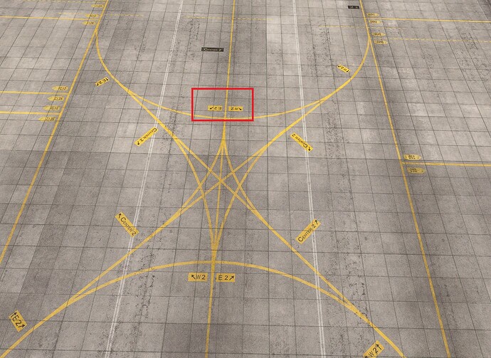
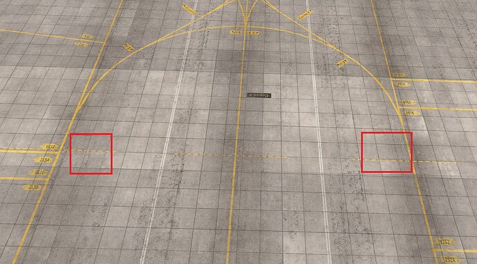
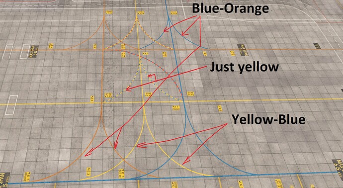
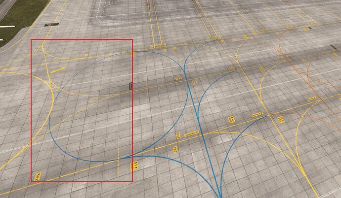
You´re missing the colors of the taxiways here. They should be orange and blue, rather than black. Also, when a blue/orange line joins a orange/blue one, the color is dashed for a few meters.
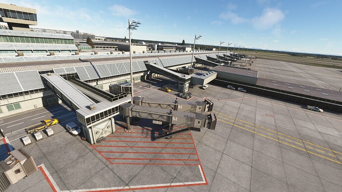
The gate that´s had a third jetway for the longest time doesn´t have it in your rendition, talking about position 113 serving the Emirates A380 amongst other smaller ones.
For some reason, the engine run up area is completely missing.
The construction site has advanced quite a bit and there´s actually buildings now. The new economy parking garages are pretty white as they´re really new, but I´m missing the blue sign showing the number of the garage. Also, being that white, they look like an untextured model imo so maybe there´s something you can do about that while still keeping their “fresh” look.
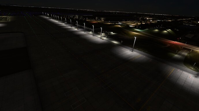
The lights are pretty weak at some points. Terminal 1 is rather bad I´d say really showing kind of lit up circles and rather extreme transitions. Some of those can also be found at Terminal 2, for example on the east side of the satellite building or any apron position in the east (eastern apron extension for example). The western side of the satellite building does that a notch better, but the area cought by the light is still pretty small. Normally the lights reach further towards taxiway E2.
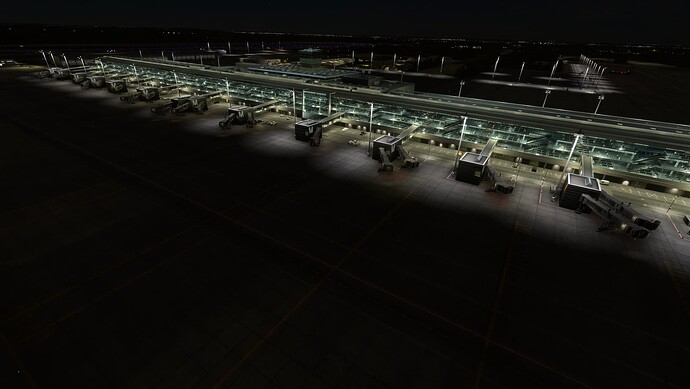
I know there´s kind of light limitations in MSFS 2020 and hope it´ll be better in 2024, but the lights at the main Terminal 2 building do a pretty good job imo, look best of all around the airport and also Terminal 1 positions 161 to 164 are doing a pretty good job. I don´t relly know what´s the reason that the lights are so different in terms of the amound of surface they light up. But I´m not a dev so I can just point it out and leave fixing of it to you professionals.
That´s everything I have for now. Hope feedback is appreciated and that it helps you with improving your sceneries even more.
All the best, keep the work going.
EDIT: One more thing: I just noticed that while T2 satellite is modelled with interior to a really high degree, there´s only 2D textures on the windows of the main T2 terminal building. Would be great if GAYA could make a change to other developers and model the interior of main T2 as well. Otherwise you´d probably always prefer satellite over main terminal and I don´t think that´s what we want in the sim, having people prefer certain parts of airports over others just because there´s a massive decrease in quality at some spots.
