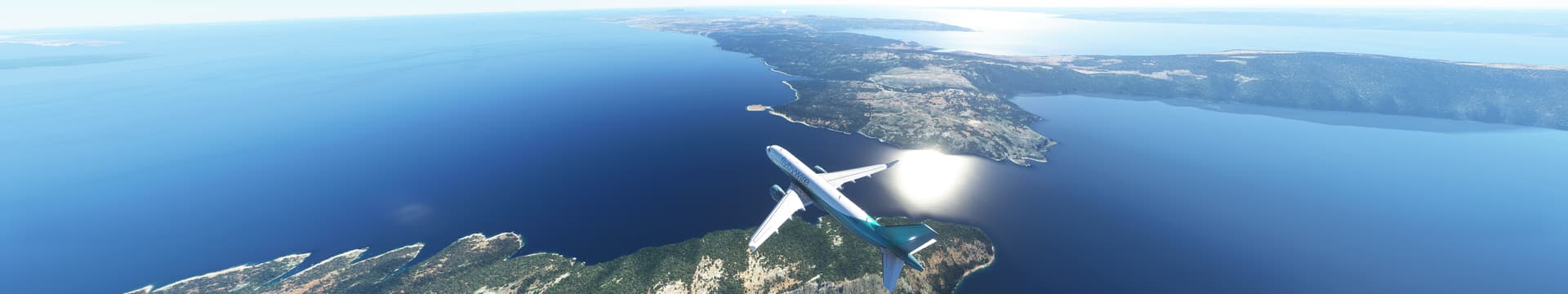
sorry back at you - these are not in the same place / weather / time so its impossible to compare ![]()
but you are right about one thing - xplane 12 looks way better than either.
sorry back at you - these are not in the same place / weather / time so its impossible to compare ![]()
but you are right about one thing - xplane 12 looks way better than either.
I would like to - but unfortunately I haven’t found any more without filters applied, that’s the first thing I did after the 2nd start of MSFS2020 - of course this is also a matter of taste - I’m not saying MSFS2024 looks 100% realistic - but to say stock MSFS2020 looks realistic (as you can see above, regardless of whether the same conditions prevail) is just a bit bold. I am sure that many videos and screenshots of MSFS2020 have filters applied.
The global illumination is definitely better in the ‘new’ one, but they look a little more washed out, yes !
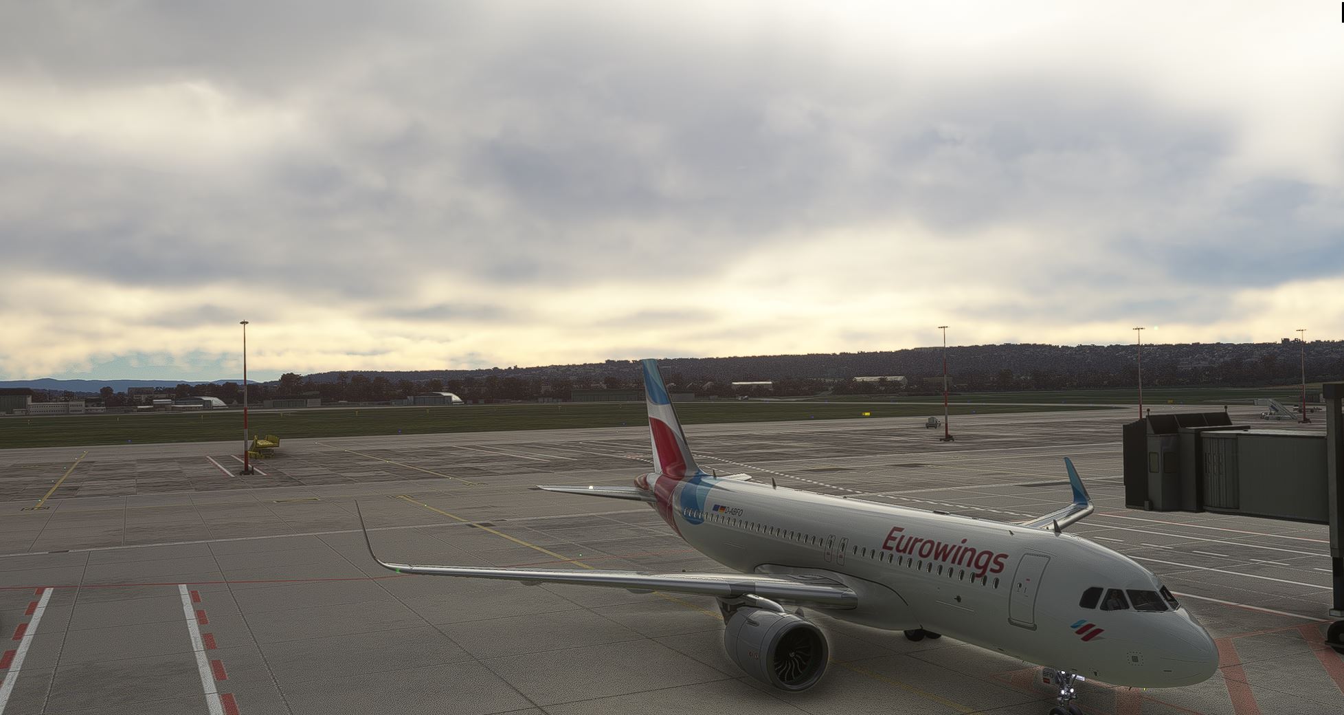
MSFS2020 with filters - roughly the same look (as my 2024) !
maybe not so bizarre
a lifetime ago i was a 3d artist, nothing related to games though, mainly architecture
i quickly learned the hard way that replacing any given 3d object (a chair a table whatever) with a “better” one, be that better drawn, more detailed, better textures…
not necessarily produced a better result, a lot of times the scene ended up looking worse because the previous object blended much better with its surroundings, and the new one looks completely out of place… so now more work was needed to make it look right beyond just swapping one object for another
i think something similar is happening with the trees… they just tossed them in there, but ended up looking worse than the old trees, suject to opinion of course as is this whole topic
fascinating and makes a ton of sense.
what feels real is so subjective and emotional, but perhaps on top of your observation yet another way to see this is:
human faces - when they look perfect, they are fine - when they look stylized, they are fine - but when they’re * just * off, they look terrifying and unreal.
I think MSFS 2020 had flaws but actually looked believable especially with some small tweaks.
MSFS 2024 just feels a bit dystopian / fake / gamey / cartoonish despite ‘technically’ better lighting etc.
That would be the uncanny valley look. Interesting side note, the humans in FS24 look like garbage, especially passengers in career mode. Asobo also made A Plague Tale Requiem years ago, which has great looking people. It really makes you wonder just what the heck happened that made them think FS24 is the desired look.
they probably used some off the shelf pre-made 3d models for the characters, the same as with the animals
Hi, this has nothing to do with being in love, I’m a commercial pilot myself and I see things live and in color, the colors in msfs 24 are very close to reality, the lighting is definitely more realistic, in msfs 20 they looked out of the cockpit to the right and didn’t see anything of the surroundings. Everything was completely overexposed. That’s done really well in 24. Ultimately, everyone sees things differently, if they like the 20 better, that’s OK.
Love it. Then please show us the photographs in different situations ! i think you might be surprised. Especially given 2020 can be fixed with a little correction.
2024 lacks fine tuning.
2020 has a better “big picture” cause it has years of adjusting.
In principle, I think, 2024 has better ingredients and has potential to create a much better whole.
But it will take time to fine tune.
Right now they just have thrown everything in a pan, but a good food needs much more than that.
That is fascinating. The moment technical results realize subjective perception, there are as many opinions as there are minds. I think, as a result, you can’t do such things right. As a developer, you adhere to all technical standards, people who really know a lot about color and representation say something like “Saturation and color space are much more realistic” and then the laymen come along and say “Looks terrible.”
You probably have to live with it as it is. One person thinks it’s great, the other feels the opposite.
And then we’re all creatures of habit. What we’ve had for a long time and consistently, we want it that way again. Even if it was absolute garbage.
In the long term, it is absolutely to be expected that the 24 will outperform the 20 in practically all disciplines. Because that’s the declared aim of an upgrade, isn’t it?
Really nice screenshots.
And now go back to 2010. The cover pictures of the dvd box wouldn’t have looked that good.
a lot of people of course genuinely prefer 2024:
however, those of us who aren’t satisfied have a different criteria:
I do agree that somehow it looks more cartoonish, but I can’t tell you exactly how or why! The lighting is certainly better and some elements look more realistic but something about it looks off.
The excessive amount of trees is one factor.
Gradients between forests and fields are abrupt. In general nature has smoother transitions in those areas.
It goes to colors and contrast as well. Too harsh.
I would add that, when we look at the world, we see continuity. Even when something pop out more, there is continuity. We perceive the world as a whole.
Right now this feeling is not working very well. The elements in the simulator need to blend togheter better.
Strongly disagree. I was a heavy user of 2020, and now heavy user of 2024. 2024’s colour palette and lighting are years ahead of 2020s, which looked arcadey in comparison.
Famously, a guy who now works for Laminar had to tell us exactly what was wrong with 2020s colours, and even after that they were only able to make partial improvements.
See what I mean? Fascinating.
No. I believe Asobo knows that FS24 is visually superior to FS20, especially the lighting and colours.
I agree! to me 2024 looks really cartoonish 2020 looks much better for me
2024 has ruined 2020.
At least for me. Pilot and 3D graphics dev here, and I have to say 2024 color rendition and exposure has improved quite a bit in a lot of situations, and improved massively in some specific ones. It’s situation dependent though, so depending on where and when you fly, you’re going to get different results. Then it’s also subjective of course, but I’m willing to bet most players will notice a positive change in their experience.