I’m guessing(hoping?) that the reorganization and re-coloring of the forum categories is still a work in progress, but I’m a bit confused already.
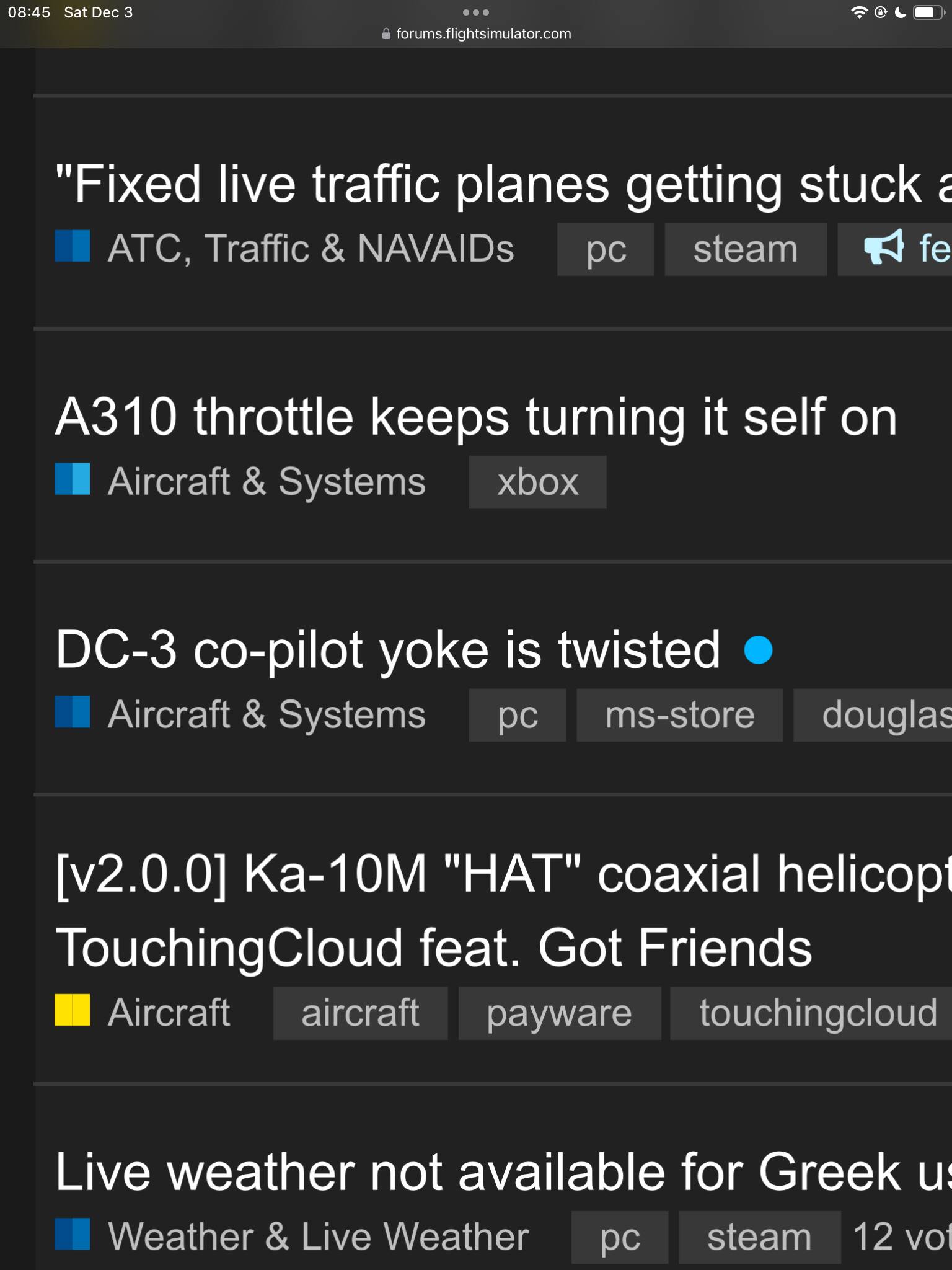
Besides the seems-like-an-awful-lot-of-subtle-shades-of-blue coloring, why are these two “Aircraft & Systems” threads utilizing two different two-tone shades of blue when they are the same category?
See this zoomed on screenshot:
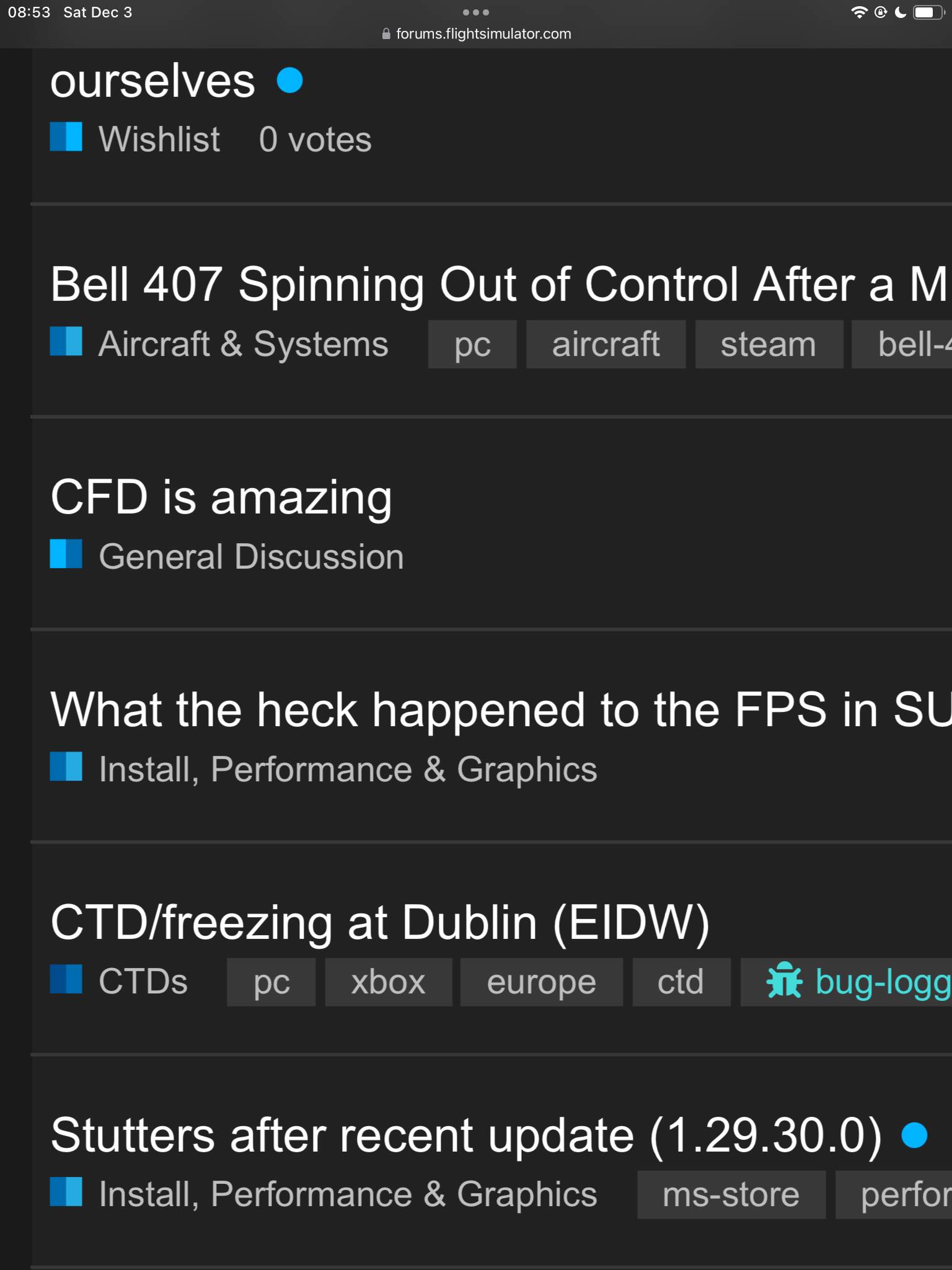
Here’s another example where I’m confused.
Why is the General Discussion light blue/dark blue and all the others dark blue/light blue?
I don’t really understand what these two-tone color schemes are supposed to be communicating to me and how to differentiate all the subtleties of blue.
Thanks, but what about the category that has two different two-tone indicators?
Is that a forum rendering bug or are individual categories now going to be using more than one two-tone color scheme?
I feel my question is lost in translation here.
I’m not talking about the two-tone, in general. I’m talking about TWO DIFFERENT two-tones being used for the same category.
Look carefully at my first screenshot, the Aircraft & Systems category is being shown with two different two-tone color schemes. Why?
1 Like
I’m going add, too, that a color key or an explanation addendum be added to explain the purpose of the two-tone coloring in terms of what it communicates that makes it different from the solid category colors.
I like it from a graphic design/esthetics standpoint, but there is, obviously, more to it than visuals.
3 Likes
And please think of those of us suffering from visual impairment. We need an option to select simpler, plainer colours.
3 Likes
yes, a path-marker:

==>

Example for other category:

==>

Therefore is the feedback, that these color schema is’nt good ( or better very missleading ). But not the Two-Colors, more “same or very similar colors” for different categories and more worst " sub-categories can have same colors as completly different top categories now".
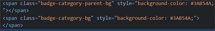
In eg. VR or Thirdparty are all Sub-Categories same colored as the top category, and so it looks like one “green” icon if we are in sub-category


But there are still two color-areas in that “gree icon”
PS: @Hester40MT .. correct me if that was not meant 
1 Like
Thanks for this.
It really does seem to boil down to a poor choice in using varying shades of blue rather than starkly contrasting, clearly definable variations in color.
1 Like
The colors will look off for a little while during the forum changes throughout December - sorry about that!
4 Likes