Totaly agree with this. Flight planning with the EFB is so clunky and time consuming. Great having the EFB but why take away what we had. Which was faster and more transparent.
1 Like
When you say modding the menus, is it replacing the images or being able to rework the layout?
The simulator in its core value is great as I mentioned many times here, but I have to admit that the experience in the interaction with the menus , especially control setups can be frustrating and needs refinement…
I think like many other users here that the UI experience is done mainly for XBox (first) with gamepads in mind.
I am not sure for example, we need to 1) select a controller, 2) press the Search by input button and then 3) press the controller button… I am not sure if any technical limitation does not allow someone to press any button or key in their 3 or 4 controller connected + keyboard and mouse and then the UI will detect the controller and its button and display the assigned action?
And then does the user need the multiple layers of saving those control assignments (general controls, airplane controls and then the specific model)…
The aircraft page seemed more refined in the 2020 edition and that lovely Hangar feature , not sure why it was disabled.
In the sim itself the glowing quick menu on the windshield could have an option to be disabled (shortcuts to open the EFB, Weather etc). And I wonder if it is there already and I could not find it , but having a keyboard key (modifier - i.e: Ctrl) coupled with the mouse to rotate a knob in the cockpit to avoid having a Zoom in or out if we have a shaking cockpit, would have been a simple solution…
Etc,
Anyways, as I mentioned before, I was hoping for and dreaming about an enthusiast edition for PC users with minimalistic and windows like experience in the UIs and usability.
Now if we can do this customization in the actual experience of the menus, that would be awesome and I can help considering it is my real life job.
Cheers
To make this simple… so do I. Its like a down grade Its more for a lack of a better word kiddish.
Agree with the original post, not to mention the hideous control bindings, VR graphics settings now hidden under VR. No option to properly resize UI such as ATC windows, missing options such as lens flare. During these low level canyon runs, big green and red score boxes flashing smack in the middle of the screen. The whole thing is hideous.
1 Like
I sound like a broken record, but here’s my 2.3yen:
A smaller scoped project that works frictionlessly has an outsized positive customer experience impact as opposed to a large scoped project that feels like some clunky Heath Robinson contraption and has an outsized negative customer experience.
While an impressive contraption, and the ball rolls beautifully down some isolated secions before randomly falling off and plunging to the ground, it just doesn’t work well to do what it’s designed to do in the stated vistion/marketing hype.
End result: threads like this, and many others.
There are many small ways to improve all areas of the simulator interface.
For example, the Free Flight screen.
When we select an airport, a sizable sign automatically appears, obscuring part of the airport, and sometimes it’s difficult to select a departure point, such as a parking area.
Furthermore, the departure point doesn’t change to a selection color and remains white, like the rest of the parking areas.

Based on the current interface design, there are several better places to place these floating windows.
An example would be this one, created by me with a bit of editing of a screenshot of the Free Flight screen, taking advantage of the airport information box, which currently has little information.
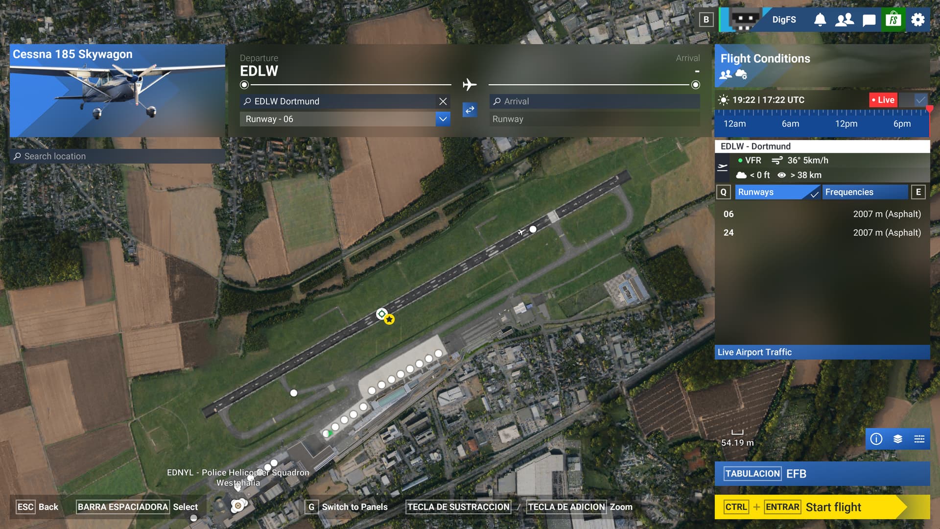
With this simple change, you get the same information, but integrated into the box dedicated to airport information. This also creates a cleaner main screen that doesn’t obscure other elements of interest, such as parking areas and boarding gates, or the view of other users on the map.
This is just one example; there are many other places where major changes aren’t needed. Just a rethinking of usability and better use of screen space.
2 Likes
I’ll add that, specially regarding to user experience, it’s very frustrating that changing the airplane or changing the departure gate erases an entire flightplan and yoyu have to do it all over again. Not to talk about the broken things on the EFB. Kudos to GotFriends who released a free legacy loading interface.
I just want to say this is a great post! It highlights some of the goofiness they did with 2024 and you perfectly compared the two to show the regressions. I’ve been sharing this post constantly!
1 Like
100% agree with the OP
1 Like