Hello,
Could MSFS Team review the UI of MSFS to be in line with the previous FS2004 and FS2010?
A light, solid and simple local (on the PC) interface, not a full screen transparent overlay internet interface. Once the flight is loaded then the sim runs full screen like FS9 and FS10 and the sim connects to internet for satellite data streaming and real weather etc.
But the interface loading should be like FS9 or FS10, windowed, without flashing 4 credits for about 1min before even starting to load the interface which takes another 1 to 3min (?) to show updates, world japan is there etc to (finally) show the interface? The funny (?) thing is that there is the NEWS tab alright which present the updates development details so why putting it in the loading, once the UI is loaded we’ll surely see it right? If we want see credits we click on an about section then credits etc should be there, likewise with development or updates, a section should be there on the UI (remember the FS10 one?).
Every single time we launch the sim, we get flashed 4 credits full screen, not a brainwash is it, maybe the very first time after initial install ok, but not on every single sim launch.
Once we click on the MSFS icon on the desktop (or wherever it is on our PC) we should get to the MSFS UI as soon as possible, given the sim the time to load its raw data, then if we want see some credits we click on about section in the Ui, if we want see what’s going on with MSFS development and updates etc then we click on the corresponding section in the UI etc.
I believe this overlay thing is what causes performances and stability issues with MSFS, and make the fans go noisy when it could run easily and more performant like FS9 and FS10 and most of all SILENTLY , without all this layer on top of the running.
I checked my CPU and GPU performances when running MSFS and compared them to the performances I used to have when running FS9 and FS10 and they are about the same but I can hear the fans now, before I barely heard them for same use. Of course MSFS uses more memory on the GPU but using more memory doesn’t make the fan go crazy. The overlay does..
MSFS should run silent or near silent…fan whisper is ok.
Also no menu bar on top like before, that we can hide with ALT long press then make it reappear by ALT press, then we could EASILY navigate to where we wanted in the sim, even quit the sim directly, not having to go through 2 or 3 layers before being able to do so or navigate in the sim..?
What about the famous V screenshot, now replaced with VFR map? I don’t understand why MSFS has no take screenshot shortcut, instead of having to use third party to take screenshot?
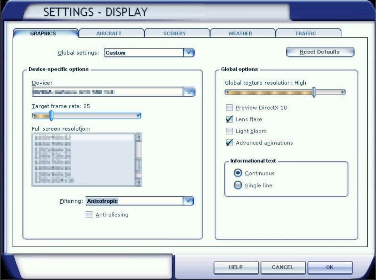
REMEMBER THOSE?:
FS9
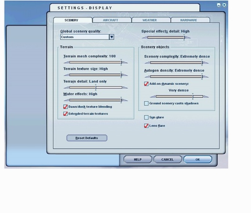
FS10
Not the same now:
FS20
