Would be nice if the difference between parking spot & gate would be shown in form of an icon when you zoom to details on the worldmap. I often find myself picking spots I regret after I’m ingame.
For example
Parking could show parking strip icon
small gate an airplane hangar
medium gate passenger boarding stairs
Large gate a ramp icon
Well, when you pick a spot, you can read what the parking spot type is from the drop down menu. If you don’t like what it is, you can pick another parking spot either from the same drop down menu to a parking spot that you prefer, or pick another icon and see what it is from the same drop down menu again.
You can check from here until you’re happy and you can start your flight.
Seems like a hassle, when there could be a size/colour/icon distinction between the dots as well.
My suggestion would be to have square icons for gate/jetway stands, and dots for the GA stands. Then have a size difference between the dots based on the gate size. Perhaps add some lines inside the dots/squares, where every line is a size larger than small. I’d say that fits a little more with the current map aesthetic.
It does need to fit the current map aesthetic I guess yush. I can’t really tell the difference by the drop down menu & still end up with spots I don’t like.
The tag large/medium/small help somewhat at least,but still end up in spots I don’t like quite often.
Certainly interesting suggestions.Only colour icons might still not be enough clarification.With size of icon however it might be enough & clear enough.Different icons would help a lot
& the suggestions of @Supermuskox might work too.
Another possibility might be a preview in a small window of the chosen spot before you start loading into the game.A camera showing it from all angles in mini map form.
A mini version of when the game is done loading & where you have to hit play.
Clarification with icons of different size/shape/colour might be less of a pain than a mini preview of the spot.A mini preview of all the spots might starting causing loading issues or so though.
A few more inspiring examples maybe:
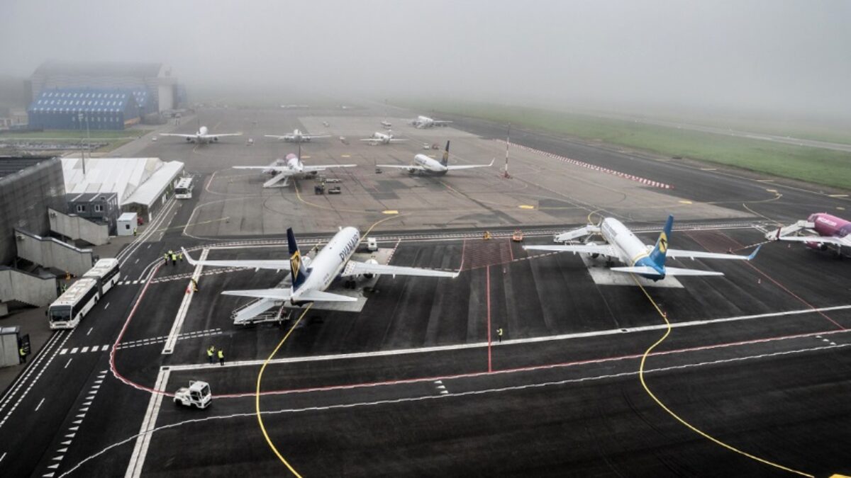
The new icon for parking could be inspired by this
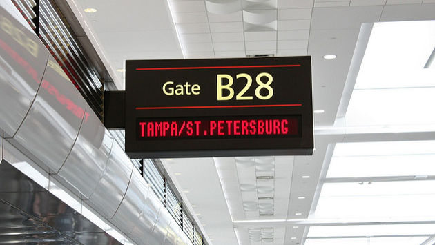
For gate :
And with the wishlist topic Live Traffic Flightplans Based on Actual Flightplans - #3 by TripsyTipsy
Gates with actual flightplans could maybe show so during the flight planning too. A certain number of gates dedicated to popular flights for a given airport & some gates to configure your own flight plan like we are used to.For the ones who are occupied for ongoing flight schedule ,it could be included at the zoom detail maybe ,mentioning under the gate that a flight to a fixed destination is about to depart from a certain gate.On the other hand ,this shouldn’t limit players from choosing the gate they want.But maybe phasing would solve that.Or it could remain optional for players to flight the route or not at that gate.if they want to gain a better reputation with a certain company to unlock new airplane skins or so
I feel ya with the headaches.Overal the icons/symboles & legend is vague.
There indeed is a lot of room for improvement there. Also so the players can set up the start
of a flight exactly as wanted.Its hard to find some good inspiring images
that could allow for more accurate flight planning but found a few more inspiring ones I think
;
The purple highlighted L & T shapes might be something to upgrade the flight planning
Or perhaps a Terminal highlight while hoovering over it & you are about to select one of its gates…like the terminals can be seen in dark blue in next picture.If the terminal gets highlighted when you are hoovering over it in flight planning , it might bring the much needed clarity ;
Working with highlights,for parking zones away from terminals might work too, parkings that are normally accessed by bus or for a transfer,it might just be highlighted zones with parking outlining..Just exploring some options here
Been looking for more parking outlines.The outine might be translated to icon form? for Icon it has to remain simply though.Highlighting zones might be like a helping guide to be sure that you select the type of starting spot you want.
Highlighting could also play a role in distinguishing parking vs gate zones etc based on colour codes. So players can identify each very fast in flight planning. I think that is also very important. The icon would have to be in synch & perfect balance with the highlighting in that case though. For it to remain simple & yet informative.
The highlighted purple T & L shape to indicate gate in earlier image & for example a blue parking highlights the zone with the rounded corners in this image.Indicating that its a parking zone & when the player hoovers over the parking NR the yellow line that belongs to that parking Nr lightens up. Perhaps at certain levels of zoom,you first get the different icons at like 50 procent zoom & the more detailed highlights at 80 procent & higher zoom. Or the ability to disable highlights if you only want to see the different icons for each.
Or maybe this shape fits better to indicate parking?Im not too familiar with them.
But that might also be an advantage of more detailed icons /zone highlights ; that players learn the outlines for each type of parking,if they are accurate to what they are irl.