I saw the announcement this week that the UN had voted to adopt an interesting new World Map that attempts to fix some of the distortion of traditional mercator maps.
Although I think this effort was mostly for political purposes, I still find the challenge of a flat map representing a sphere to be interesting, and I like maps.
A Mercator Projection attempts to represent a sphere on a flat surface, as a cylinder flattened out - and is what we are used to seeing. The challenge is that as you approach the poles, everything is drawn much larger than it really is.
This “Equal Earth” map attempts to reduce the distortion of the mercator projection. It’s not really useful for navigation, but I found it interesting because I’m currently doing an around the world flight across the islands of the South Pacific (in MSFS).

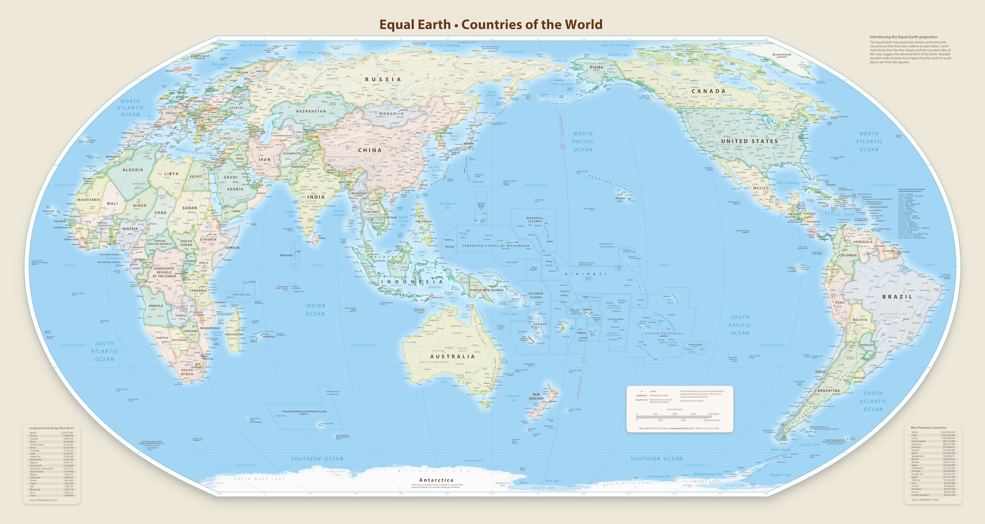
Apparently this was years in the making. Here is a video by the NACIS (North American Cartographic Information Society) a few years ago explaining it:
I’m disappointed they didn’t also rotate vertically to add 2 maps from each pole. That’s the limitation of flat maps. Any 3D sperical rendering - like the world map in MSFS and in Navigraph Charts - is always going to be better than a flat map.