Yes, its weird. Also the thing to realise about how Spad works is it only records a data point when something changes. So if I sat controls centred for half an hour, and it really did show 0 with no changes, your graph would be a dot!
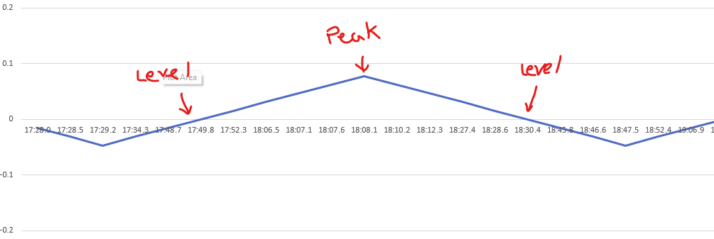
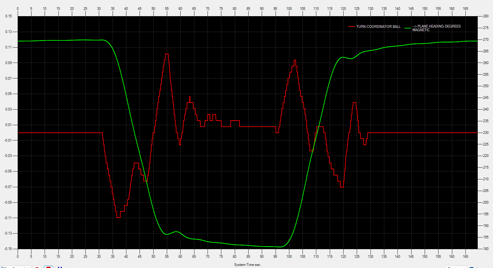
As I enter that right turn, you can see the number go positive, hit a maximum, then eventually return to 0. It might be clearer seeing the actual numbers that I generated the graph from.
If it were the other tool you would see the graph continuously logging even if the data doesn’t change. But for some reason it just won’t allow me to read from the SimVar for the turn co-ordinator.
I just figured out why I couldn’t read the turn coordinator in the other tool. I had to change the unit of measurement to “Bool” from the default.
![]()
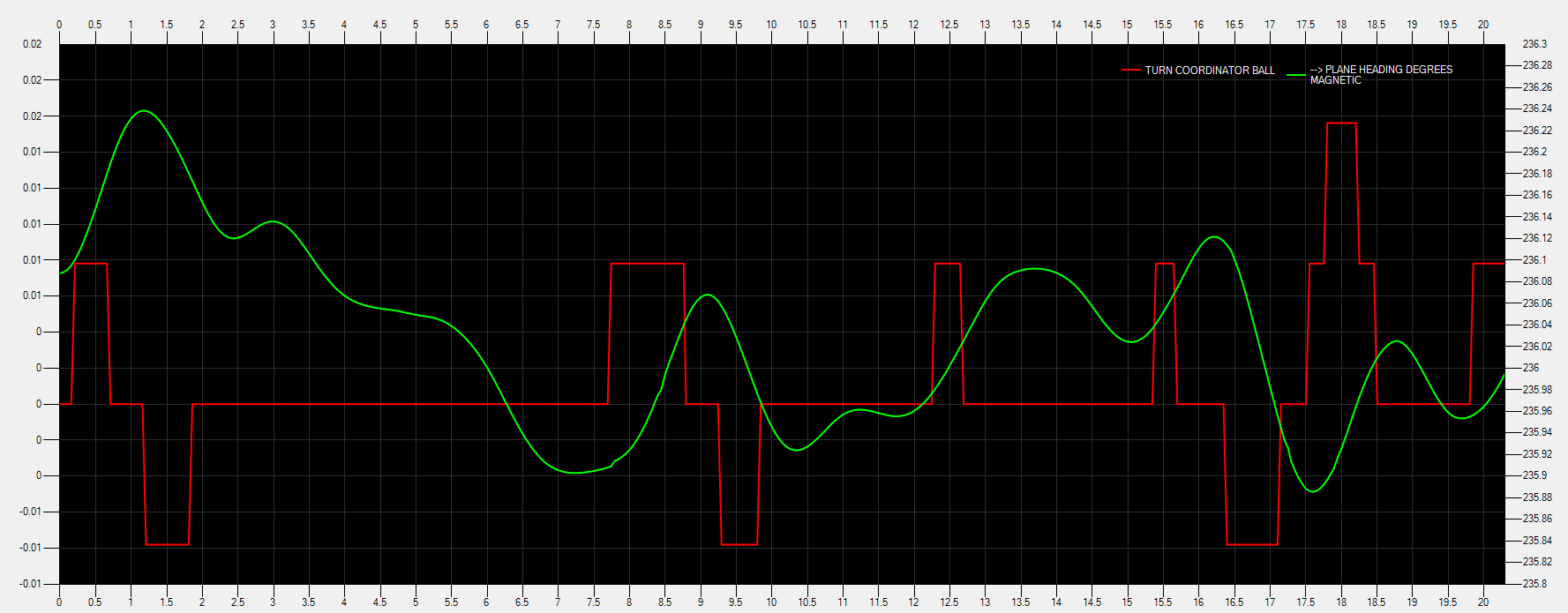
Just playing around with the PAC 750 XSTOL, so zero wind in level flight it bounces around close to 0. The scale of the graph makes it look more harsh than it really is, but I can draw the two graphs with separate scales to make the graph easier to interpret.
For example, here’s 10 seconds of level flight at 50ms interval. It looks really jerky till you look at the scales. The changes are miniscule.
Here’s nearly three minutes: