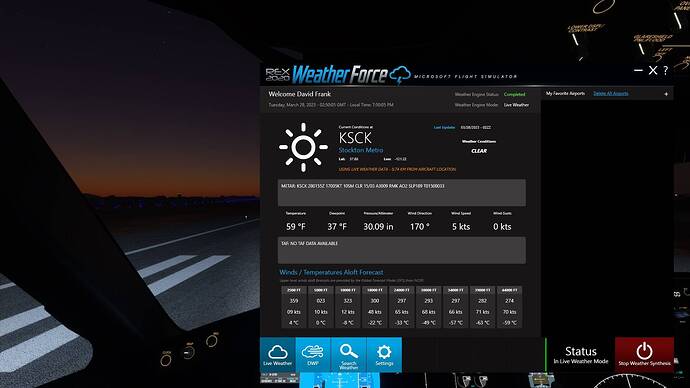
Doing a little experiment here. Loaded up at the local airport. I live directly north. Outside of my window we have a front moving in.
First image is MSFS weather along with METAR. You can see that the METAR is showing clear but because of MB you get a front moving in.
The second image is just using METAR based data which will only use the METAR closest to the user. Because of this, everything else is clear because the METAR hasn’t updated yet. So which is more realistic? Definitely the first one. But it’s only realistic because MB is filling in what just the METAR would be showing. So, take other options for METARS like Activesky or REX and you can see the problem. Now if it was just MB I would image things would look about +/- 90% what they should be and you wouldn’t have these hard differences between just METARS and METAR blending. How much clearer can it get about how things are being affected and their differences as well as strengths and weaknesses?

