Redesign the aircraft selection menu with better interactivity. Currently the aircraft selection menu takes a lot of mouse pointer movement and clicks to configure the aircraft / variant and livery.
The “Configure” and “Esc to Save” Keymaps don’t work if we use MSFS 2020 Traversal binding in keyboard.
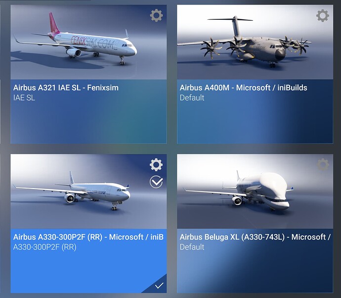
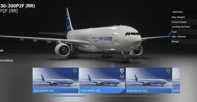
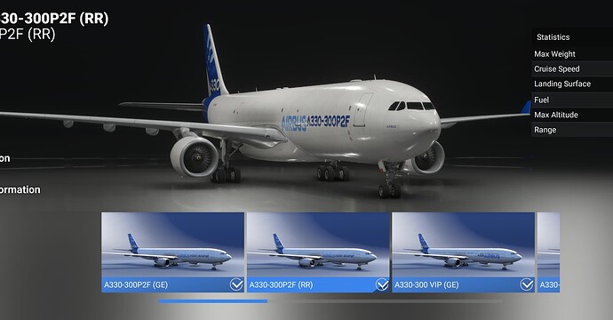
Instead of relying on this, it would be better to have a configure icon right on the thumbnails of each aircraft which should be clickable and upon clicking should take you to the variant selection menu where each variant thumbnail again should have a livery icon clicking which should take you to the livery selection menu.
This thumbnails should also have a small tick / confirm icon which should behave like the “Esc to Save” option I mentioned above.
Here are a few mockups that I created to get the point across. I am not an UI / UX designer, so excuse the lacking icon choice, but this should explain the idea behind it.
Main selection menu
Variant selection menu
Livery selection menu
This small tweaks may make it a more fluent experience to configure an aircraft to our liking.
Also, if it makes sense, please bring back the msfs 2020 hangar, and get rid of the aircraft rendering view on top of the horizontal submenus, instead make those submenus a 3x3 or 3x4 grid so that more screen real estate can be used before needing scrolling.
Edit: Add a favorites section and may be a star on livery items please. so that we can just select the liveries and enable that star icon to save them in favorites. Thanks @Jie2193 for reminding.


