The current font for taxiway names is unrealistic and hard to read. Taxiway signs in the United States use U.S. Department of Transportation Federal Highway Administration Office of Traffic Operations 1966 Edition Standard Alphabets for Highway Signs, Series C upper case. This is alternatively called “FHWA series C” and is colloquially known as “Highway Gothic.” This font has been curated specifically for road signs and taxiway signs so that they can be legible at high speeds and with a substantial amount of glare (which the current signs struggle with).
See pages 33-46 of this FAA Advisory Circular. https://www.faa.gov/documentLibrary/media/Advisory_Circular/150_5345_44j.pdf
Compare these real signs:
https://www.flightliteracy.com/wp-content/uploads/2017/12/14-18.jpg

to MSFS signs:
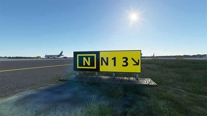
Specifically note how small the lettering is, how thin the arrow is, how weirdly spaced out the numbers are, and how small the rectangular border is compared to real life.
The real signs have much larger text so that they are legible from far away.
Please fix the MSFS so that they use the real font, both for legibility and realism (they currently make the sim look very video-game-like even though every other aspect of the sim feels very real).
More observations:
VOTE ON OTHER TAXIWAY SIGN ISSUE THREADS!
Taxiway Sign Size Incorrect at All Airports [Too Small]
Taxiway Sign Font Incorrect & Hard to Read
Taxiway Sign Contrast / Glare Makes Them Illegible [WAY too bright!]
Information Taxiway Signs Incorrectly Implemented (Wrong Colors)
Ability to Create Two-Sided Taxiway Signs
Revamped Taxiway Paint / Markings (they look noticeably inaccurate right now)