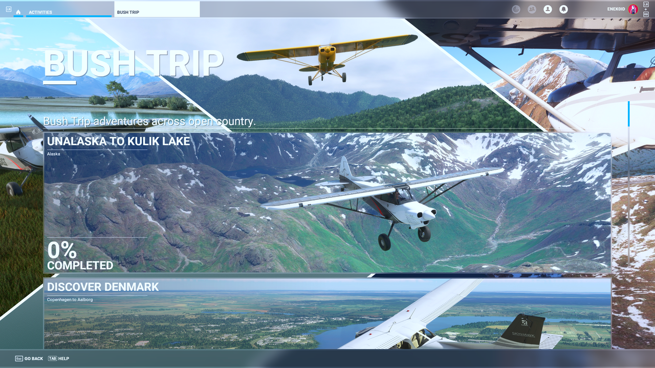
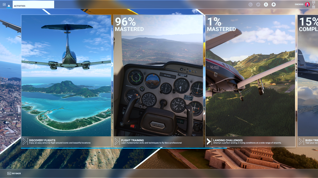
I don’t understand why Asobo decided to use huge tiles for the UI. It is excessive even for console users. 2-3 items per 2560x1440 screen is just dumb, and the tiles become bigger and bigger after every update.
Look at the bush trips for example… I have to dislocate my index finger to get to the bush trip I am doing!
Asobo please give us an option for a decent UI. The current one isn’t good even for console users.
The UI is the less user-friendly that I have seen for a long time. The guy in charge was obviously trying to do something « modern » instead of doing something useful.
What really annoys me is the « open filters » menu of the World Map. To have to open and close it each time you want to change an option is a PITA. Apparently he/she doesn’t know about the tool icon bar concept…
The filters in the World Map are Indeed a shame to the sim.
These are such a powerful tool which didn’t exist in any sim before, this can be priceless while editing your flight plan, but you can’t use it.
It is too heavy to go to filters menu, Select a filter, close the menu, open it again, add another filter, close the menu, open it again to delete the first filter, close the menu…
9 clicks which can be done in 3 with a set of icons always visible and intelligently placed in a corner of the screen.
This was one of my replies to a discussion we were having with FSAcademy re. specific mission categories and the msfs ui.
…and another from a wishlist reuest I made.
I think the above posts say it all for me.
These giant pictures and adverts plus not be able to sort things, or list them. I’ve been gone from MSFS for a long time because of the UI, but I keep checking back now and again hoping that I can make a return to msfs2020.
While the UI is like this for PC..
I’d rather run FSX with FS global ultimate NG mesh and Horizon sims VFR GenX3 whole of UK/IRE.
I get sharp and jagged mountains peaks, working ATC, archived weather for any given time and satellite imagery.
The best thing about it, it is all completely offline.
FSX also has a built in flightplanner that just works and you can also toggle all the filters.
IFR/VFR/Low/High NDB’s etc. and no multliple clicks to get there either, the list goes on.
So yeah, microsoft have a lot to do to pull me back in and while the msfs UI is what it is, no chance.
Yes it is bad, really bad, eg, I would like to see more drop-down list, especially for the controller configurations, it is a pain to browse through them every time you want to change aircraft
I am happy to accept that, for XBox users, the UI may be appropriate.
But surely we are owed a UI using the latest Win 11 round-edged standard windows, and an interface appropriate to a PC user.
Being honest here, I could not care less about a win11, roundy nice UI.
The first thing I do is to set the PC for best performance under advanced settings. Then customize it, so that means turning off all transparency, fading in/out, sliding combo’s, no transparency etc.
I don’t want any Windows UI taking more resources than the bare minimum it needs to run.
fyi, jic you think I’m low on hardware and don’t have the resources.
My PC specs: i9 10920X(wc) - 1000w - 64gb in quad channel - GTX titanX - nvme’s and ssd’s.
The msfs20 UI is a disgrace for the PC. It’s been designed as someone else alluded to, as a UI desgned for xbox controllers. Move the menu left/right/up/down with a thumbstick and bang away on an ‘A’ Button.
As i said previously..
The UI let me leave msfs a long time ago and this is not said as a childish ‘throw the toys out the pram’, if the UI doesn’t change, then i’ll not come back to msfs. It’s just how it is.
I paid for the premium deluxe version twice.
Once from the store and another boxed version that has not been installed or activated.
We were told that we’d be able to use our fsx addon sceneries and that we’d have local scenery libraries, yet everything is under a ‘community’ folder where nearly all scenery is pretty much tied to bing.
msfs is just an advert for sightseeing, that is, if the servers are up.
I agree. There’s a lot of cross platform games out there, and even console games have moved away from big tiles.. I’ve been playing Farcry 6 lately, and it’s PC focused UI works flawlessly with my Xbox controller.
The aircraft selection menu needs a total rework as well. It takes forever to find the aircraft I’m looking for when I can only see 8 at a time in a list of 175 aircraft.
Though parts of the UI are clumsy, such as even navigating to import flight plans, the main hair-pulling issue for me is the horrible contoller options system. Having to change to saved settings for aircraft by clicking left /right arrows, then waiting for the system to refresh, then going to the next, then the next, then the next is mind-boggling - and that’s with just a few aircraft! Down the road this access system will be a nightmare with even 10 aircraft, let alone 20-30!
This could be so much better with just drop downs! A drop-down menu would instantly show all saved aircraft, you slide the mouse down and click on it and done!
I don’t see what the problem is; this community is obsessed with screenshots, so this community is going to get an abundance of screenshots in every aspect, UI included.
There’s a search field right above; type the first two or three letters and Bingo! there’s your bird.
I never actually scroll through them…that would be silly.
There was a buzz word / practice in the world of UI Design and Experience that appeared a few years ago, when mobile started to be the new device to consider for Web sites and Web Apps and that was “Mobile First”. That means obviously, Web Sites and Web Apps are designed to have a good experience on small mobile devices first and then if placed on bigger ones (Laptop, PC browsers), they are still functional…
Other than catering for the small devices first, this would save a lot of money on UI design and implementation as well as update and maintenance among other factors…
I believe the UI strategy in MSFS is “XBox First” and it appears not only in the UI but in the usability flows that I believe are adapted to game pads rather than a mouse…
Yes, as someone who works in this domain I would have convinced the stakeholders and put a strategy to have 2 UIs, that can be switchable from the menu… This one and a more Windows PC like UI (perhaps similar to the Dev Mode components)…
I believe with a Win / PC UI + disabling by default all assistance stuff / in-sim toolbar + transition screens etc. MSFS would have been able to have a more “serious simmer” aspect / experience…
Back in the late sixties, when recording engineers would mix songs for release they would always mix it for the small transistor radios that had little mono speakers, even though people had stereo hi-fis.
Yes, I believe it could be a similar practice. At least in the job that I do (what we like to call these days UX/UI) it is, to reduce the costs and make the GUI optimized for the most important or critical platform / device first…
By the way, in the prod team we do not have much to say about this when budget is involved. So this decision might not come from Asobo or the direct prod management (on MS side), involved in MSFS but could be from higher (Stakeholders), budget approval and other business and strategical decisions.
After all, the first logo we see when we launch MSFS is XBox. Fair enough…
But I hope the direct Prod Management of MSFS will convince the decision makers to have a branch dedicated to PC users with a more minimalistic PC experience… I think this will reinforce the objective that it is a sim for simmers…