New Utility Release - Aircraft Manager Free

Hi All,

I’ve developed an addon utility to help manage plane information overload, to scratch a couple of itches I was having with the Aircraft Selection screen.

Update: Short blog post on the development of Aircraft Manager: Aircraft Manager for MSFS - Development Overview - Sonicviz

If you’re interested in testing an early release, I’ve released a free lite version you can download here to test it out:

IMPORTANT: Please check the KNOWN ISSUES section on the page link above.

I’d appreciate any feedback or issue reports, especially if you think it’s a useful utility for the wider community. Issue submission form is at the bottom of the page link.

Explainer video of the full version (still tweaking, testing, and polishing) is here:

New release with Aircraft Control Presets:

Quick Help Quides:
FREE:

PRO - Coming Soon

Thanks!

UPDATES
Update 13/02/2023

  • New free version release, no version number change.
  • Performance improvements + fixes
  • Mandatory install for data migration prior to pro version release, if you want to keep your current tags.

Anticipate Pro version release in the next day or so.
Highly suggest testing with this version first though, especially if you intend to upgrade and edit your current tags.

Update 19/1/2023

  • New free version release, no version number change.
  • Performance improvements + Larger image for >2K screen resolution (adjust font to see).

Update 18/1/2023

  • New free version release, no version number change.
  • Performance improvements + UI/UX improvements.

Update #2 9/1/2023

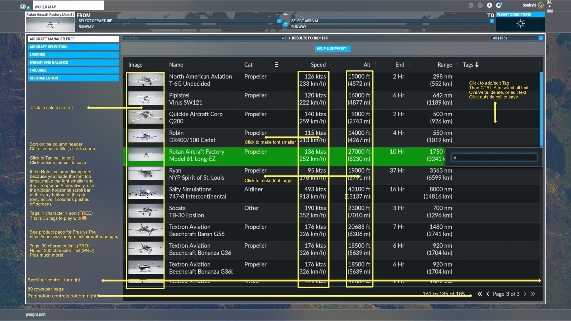
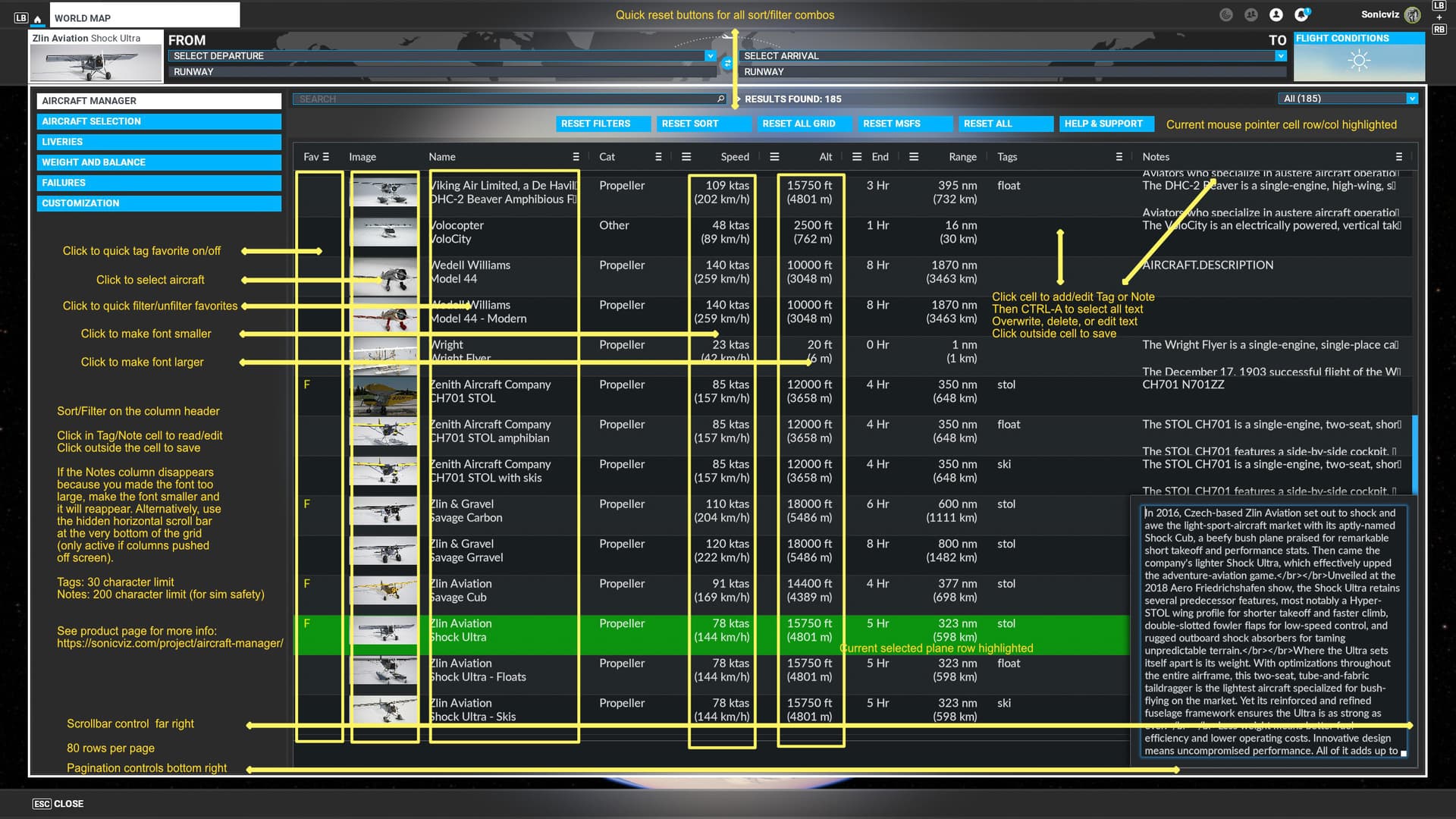
  • Due to memory issues with integrating into the MSFS UI a hybrid pagination/scroll system has been implemented to avoid any issues. Page size is currently set at 80 rows to stike a balance between utility, performance, and bug free use.
  • Search Integration: Search via the MSFS search boxes is bi-directional (both ways) between AM and MSFS aircraft selection. AM filtering is restricted to within AM as the search functions for them do not currently exist in MSFS.

Update 9/1/2023

New free version release, no version number change. Resolve memory issues with scrolling of large aircraft collections.

Update 8/1/2023
New free version released. Check the Known Issues and Help guides on Aircraft Manager - Sonicviz and new download link.

No version number change:

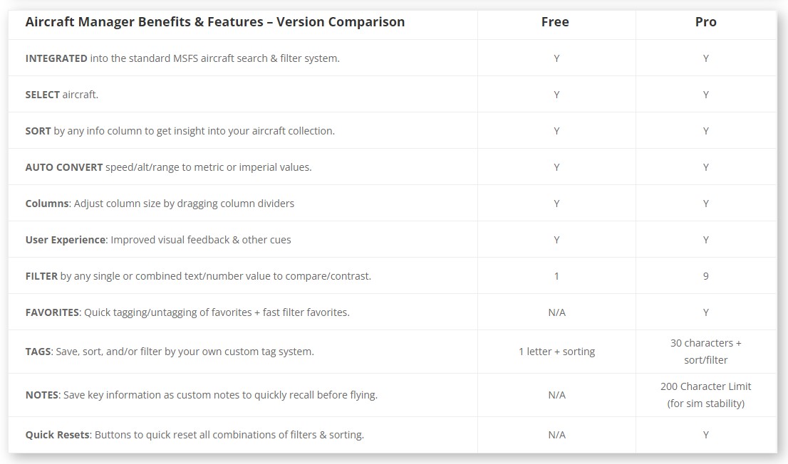
  • Added new Free version features – see Benefits and Features table @ website link above
  • User controllable font size to adapt to different screen resolutions
  • Many under the hood fixes and improvements.

Barring any showstoppers that pop up, this is the final version prior to release.
Please let me know of any issues you come across.

Update 5/1/2023
New video explainer including the new favourites functionality and dark mode, combined with the tweaks outlined below.

Update 4/1/2023

Updated the Free Demo, link available from Aircraft Manager for MSFS - Sonicviz

No change in version number, but a summary of tweaks:
[see website product page]

13 Likes

This looks amazing!!! I’ll give it a spin tonight and get back to you! Thanks!!

Awesome, thanks!

2 Likes

the one function i need is to be able to hide duplicate airframes

for example, i dont want to be presented with 5 or 6 different versions of an airplane if i will only ever fly 1.
if i only land on paved runways , i dont want to see floats,skis, monster truck tires, et cetera

6 Likes

@Sonicviz So I have had chance to install this and got to say firstly, I LOVE the idea, it is sorely needed and I didn’t even CONSIDER that modding the menus in this way is even possible. You are on to a WINNER here mate and I would love to help you out in tweaking / testing and giving you ongoing feedback if that would be useful.

Here are a few first impressions / notes / questions for ya!

FUNCTIONALITY:

  1. It’s a shame that the “Save, sort, and/or filter by your own custom tag system” is not yet in - I assume that is the way to add Favourites to a secondary group/filter? That is what personally I would find most useful in a tool like this but I understand you want to keep that back for a premium version - however that probably also needs the most feedback as to how it integrates to be user-friendly and actually faster to use than other methods like text search. Do you have any WIP version you would be prepared to share with me?
  2. What is the TIME column? I have a few at -1 and some at zero. Highest is 37 but that is not a plane I have flown much, so not sure what this is filtering? I ask because @Funghie, @MojaveHigh2379 and myself have developed an app to extract the Hobbs or Hours data from players local aircraft, and this could definitely be a useful sorting filter in this scenario too (I think they would love what you are doing too!). I can send you a link to the app if you are interested to check it?
  3. Any way to make a click anywhere on the ROW to select plane, not just the thumbnail?
  4. Can I not edit the NOTES column in this version? Where is it pulling that info from?
  5. Is anything planned to work on Right Clicking a row? A mini-menu with options there?
  6. Is there any way you could associate a “preferred initial livery” per plane model?
  7. Is it possible to EDIT (or override) the metadata? For example, I have some aircraft in OTHER category that are Rotorcraft etc etc.
  8. How about being able to create your own FOLDERS as a screen before this (large icons on the screen, similar size and layout to the main hangar), or accessible as a TAB BAR along the top above the table header (like in a Browser) then adding (via tickboxes per plane) individual aircraft to those folders. Same plane could be in multiple folders (hence the tickboxes) so you could manage you own minified collection but still see everything if you select the full list view as it is now. Also the saved plane would be with the assigned livery from point 6.

DESIGN:

  1. Would be a nice touch in the header titles were a bigger/bolder font AND used the icons as in the official stats (and new ones for your extra columns) to spice up the look and feel to be more like native4. The NOTES column needs to word wrap within each row, or maybe click to get a popup
  2. Maybe you could give the option to show the thumbnails at a larger size (double). I know that would make the list “longer” but if you have any text formatting control within the rows, it might look better with the Manufacturer and Model Name as a bit larger font than the “info data” columns anyway. The model name cold be BOLD below the Manufacturer
  3. And perhaps some different layouts that leave out some of the date but show it as a grid instead with info stacked below (more like the hangar but smaller thumbs to get more on screen).
  4. Maybe just my resolution but the AIR MANAGER FREE button title is missing the last E (looks a bit of a mistake but is scrolls when you are highlighted on the button). Maybe rename it somehow to fit 1 more character (HANGAR MANAGER might fit).
  5. ROTORCRAFT is truncating in the Category column (missing FT)
  6. Could you alternate the row colours (white and light grey) to make them easier to scan… on ultrawide that is a pretty wide table!
  7. Likewise, the vertical columns could do with some division (thin grey line) perhaps.

Hope it helps - I feel a bit limited in what I can say until I see what the other stuff you have planned is but I see great potential and happy to assist further should you need another pair of eyes or some UI / UX brainstorming :wink:

A while ago I did write a suggestion in a thread for exactly this functional tool. This is what I wrote originally (it may be of use to you):

Have a little “sort by” menu like in Steam:

  • Alphabetical
  • Most Used
  • Recently Used
  • Category (i.e jets, props etc - which we do have already, I know)
  • Favourites

From post #36 here:

Cheers and good luck!!

3 Likes

i think i had seen that mentioned somewhere, but is it doable on all aircraft, or only ones in the community folder? i thought the ones packaged with msfs/purchased from marketplace were encrypted and uneditabale?

Thanks for the feedback.

It may be possible to add some kind of hide checkmarking.
Will add it to the investigate list.

2 Likes

oof looks very very promising! gonna try this one out for sure :stuck_out_tongue:

(btw, on your site it says initial release 04/01/2022. Too much champagne?)

1 Like

Thanks for the feedback.

Could I ask what version sim are you on (Steam/MSFS), Live or beta, and what monitor/screen size you are running at?

It’s a tricky balance to develop something lean that has core utility/usability in an initial release vs a big bang that has a lot of potential features but can take forever to develop. I’ve opted for the former in this case mainly due to the undocumented nature of the UI system and the limitations/issues I’ve encountered so far developing this. I expect to be able to add more features over time as this understanding grows.

re: Functionality

  1. Yes, using a tag, such as “fav” as demonstrated in the video. I thought about a separate column for favourites but it’s a balance between showing core fields and screen real estate. People run on all sorts of monitors and screen resolutions with different UI scaling, so in an initial release with fixed columns it needs to be useable for all. Will consider expanding beta testing downstream a little.

  2. Time is endurance, but I can see this can be confused with flight/hobbs. Will swap it back to End. Your hobbs program is neat, seen that, nice work. I actually have this on my roadmap, but unfortunately atm it seems limited as to what local file data can be read due to how the Coherant UI works and the MSFS UI is built on top. This may change. Still investigating…

  3. Originally I had it click via Row, but other feedback indicated a discrete click zone is less confusing, as users may want to keep the current selected plane and not be forced into changing when generally browsing the grid.

  4. Notes is in the paid version, as outlined in the benefits comparison on Aircraft Manager - Sonicviz and in the video.

  5. As mentioned, there are some limitiations I’ve currently encountered developing this and this is one of them. Still investigating right click capability. It’s also a design balance between doing a potential full cross platform version and/or a PC specific version where KBM is available. Roadmap!

  6. On the todo list aleady, still investigating. Post release feature potentially.

  7. You can’t overwrite the metadata, but you can store your own versions on a per plane basis for recall. I’m very wary of the potential storage limitations with storing user data here, as it’s undocumented, and I’ve run tests on my current setup with full tags/notes @ 250 planes and it didn’t choke. So this could be implemented (already is in a minor way) but will depend on how it goes in the wild and issues encountered. You know how the SDK can change like the wind, and flip the unwary developer like an ultralight in a strong breeze :sweat: So short answer yes, but softly soflty and lean mean at first.

  8. Grouping is possible, but is an expensive solution atm. Initial plan is to release something lean and mean that moves some big rocks out of the way, then see what is possible, while considering the limitiations and breaking changes potential. Will see! Roadmapped.

re: Design

  1. Some tweaks can be done, but initial release (while noting design is important) is focused on function over form. This is due to balancing UI integration issues encountered doing a fully responsive solution (atm not possible, but may change) + screen real estate of total potential users. Notes can be wrapped, but I removed it as it kills the UX of quick data comparison which is one of the whole points.
    Possible to make this toggleable though, will add to the todo list for later.

  2. I did have larger thumbnails, but atm opted more for small visual prompt size. Like #9, it’s a balance between UX and utility. That said, might be possible to toggle, bearing in mind screen size & UI integration issues as mentioned previously. I’m walking a fine line for initial release, and want it to be useable for all. Downstream is might be possible to offer more flexible user customizable options.
    But the more complex an app is, the more chance of breaking too.

  3. Ditto per point 10+

  4. Screenshot? (also specs, as per up top, thanks!)

  5. Some columns currently truncate, due to my balancing screen width & current responsive design issues as mentioned. There may be some small glitches like this, but I don’t think they’re showstoppers atm. Or are they?

  6. As per up top, specs would be nice, and a screenshot if possible. I did try implementing alternate row colours before but ran into some issues and still poking at it. Atm I think it’s a nice to have feature, but still investigating.

  7. Will look into it.

re: Roadmap

I have lots of ideas too, but as mentioned it’s a matter of balancing complexity, doability, usability, and maintainability. So initially it will be lean and mean, then see how it goes. Lots of potential, but also some big traps for unwary players. Especially as the UI system is currently undocumented and still being developed, though in SU12 I hear the UI dev is doing a first cut release of some UI documentation. Will see!

Re: Hiding

As per response here New Utility Release - Aircraft Manager Free - #7 by Sonicviz possible, will see.

Thanks!

Looks promising and why something like this was not provided from the outset remain a mystery! :+1:

My challenge for your next project is to provide a function for automagically assigning controller profiles depending on the aircraft selected. :smirk:

1 Like

Yep, noted, thanks!

I suspect because the UI is built around a console first design paradigm, aka couch distance + controller, not a close screen (single/multi) with multiple controllers + KBM. VR was also added later. I guess they knew from their existing market experience what the PC base was like, but saw console as the design lead here.

There is some crossover between console and PC UI/UX design, but when we start looking into solutions like this it can get complex developing the right responsive solution for varied use cases.

So, short answer is, I suspect they did consider it but shelved for reasons above.

Auto controller profile switching

Not an uncommon request! It would be easier if the base UI let you assign the aircraft to the profile though. Will poke at it later, I remember having a look at that section briefly.

IL2 has multiple profiles now, I think they can be stored on a per aircraft basis?

2 Likes

Hey.
Sure, here is a screenshot. 34 inch Ultrawide 3440x1440 screen I have. Steam version. Live, never had a BETA version installed.

  1. But I can’t do that TAG in the Free one, so hard to say how that will work in practice. How slick and “nice to use ™” it is :slight_smile:
  2. Ah I see! So the -1 and zero are errors in those dev’s CFG files :smiley:
  3. I see, and yeah I agree. Could there be a mouse-over visual when you hover over the thumbnail (like a green chunky outline around the thumb) to indicate that is the hotspot?
  4. No of course it’s not a showstopper - I’m just a stickler for detail of presentation especially if it’s what looks like a simple fix :wink:

I agree with your approach though - I was just being thorough as not sure what you wanted to hear - that was everything that came to mind so you are on the right track!

One more thing, any chance to add a grabbable scroll bar handle? I have to mouse-wheel for ages to go up and down the list (209 planes installed).

And maybe, if we have this TAG system to bring favourites together, will the table remember the last sort filter you used, so if we go to this page on new boot of the game, it will have our last used view already?

1 Like

Thanks. What resolution is that, HD?

  1. The free vs paid feature set isn’t frozen in stone, so will see what balance I strike there. All feedback is welcome, the good, the bad, and the ugly. It all goes into the mixer.
  2. Yes, a/c developer data. I will look into massaging this to remove the confusion for display purposes though.
  3. Still looking into UX issues like that. As mentioned (again) there appear to be some limitations with integrations like this, but that could just be a matter of understanding an undocumented design. Working on it!
  4. There are no simple fixes :rofl: Everything has a cost for the developer - even more so working with undocumented API’s!

Scroll bars

Another one on the investigation list to resolve.

User last used settings retention

Not sure how doable that is, but added to the investigate list.

Thanks!

1 Like

Ummm… it’s ummm, QHD (superwide version of 1440p HD)

1 Like

What’s your UI scaling setting at?

This is a bit like fiddlesticks, it’s “responsive” but only to a degree.
Screen rez + MSFS UI Scaling setting can change things, and I’m still working on how to get full integration to be fully responsive, if possible. Working on it!

Does that help? I didn’t even remember that I can change it!

1 Like

That’s the one, thanks! I’m on 2K, UI scaling set at 20.
It can really change things. That’s why Free is cut off on yours atm.
If you dropped it a couple of notches it should be fully viewable, but obviously you can’t ask all users to do that. Still trying to find a good balance there.

1 Like

Lost the context as @Baracus250 's reply had a lot in it, but hiding was the last bit.
Are you refering to hiding aircraft here, or something else?

Updated the Free Demo, link available from Aircraft Manager - Sonicviz

No change in version number, but a summary of tweaks:

  • Implemented Dark Mode theme. Fits better with the MSFS UI. Tip: Mouse over the far right edge of the grid to quickly scroll up/down. It will scroll in amounts depending on how far up or down the page you are.

  • Lowercased the inbuilt categories

  • Renamed Time to End(urance)

  • Zeroed out bad data if a plane didn’t have it for speed/alt/end/range to 0 (N/A).

  • Add Auto convert speed/alt/range to metric or imperial values to the free lite demo.

Also updated the OP with this change.

2 Likes