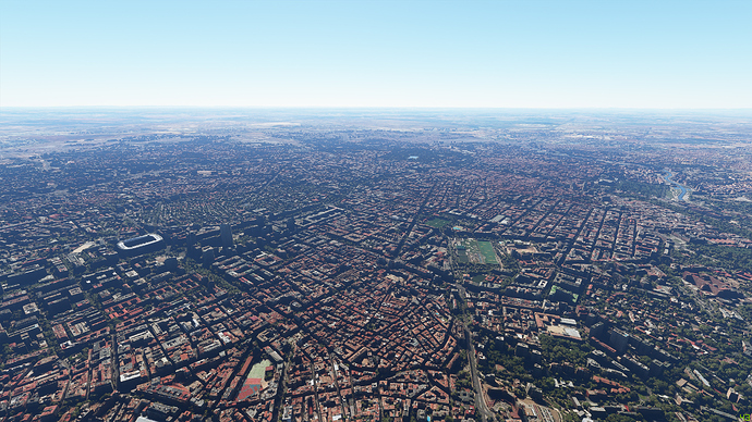
Hi everyone again. Ok, so after Patch 2, and lots of posts about differences in the visuals, I did a post comparing pre and post patch 2 screenshots. So after patch 3 and, guess what, a lot of posts about differences in the visuals, I now present to you an extended version of my previous post with new post patch 3 screenshots included for comparison.
TL;DR - As previously found, very little difference from pre to post patch 2. Trees slightly reduced, and possibly slight sharpening. From pre to post patch 3, the differences are small again - possibly further sharpening, possibly some slight lightening and water reflections are more muted. I can see no evidence of material downgrading of the visuals on my set up with my settings.
In order to try to objectively assess whether the detail has or hasn’t been turned down, I’ve recreate screenshots from before patch 2 and now also patch 3. Unfortunately this isn’t as easy as you might think as the weather/lighting etc can make the screenshots look quite different. However, I’ve had a go and you can judge for yourselves.
One thing that does need comment before we get into this is the wind and the waves. Unfortunately I don’t know what the wind speed was when I took the first pictures. What I do know is that generally I had to increase the wind speed to 15-20Kts to get similar wave effect pre patch 3. Post patch 3, however, that is more down at the 5-6Kts, so the wind : wave ration has definitely altered in patch 3 and feels more natural and gives waves at much lower wind settings. I thnk this is a good thing.
First off, here are my settings (Ultra everything with maxed out LODs, ground vehicles and shadows):
My rig:
i9 10900K
RTX 2080 Super
32Gb RAM
dedicated SSD for MSFS
As you can see from the screenshots, I’m getting 40+ FPS most places, although the numbers are artifically high as these screenshots were taken using SET PAUSE ON (NEVER use active pause!!) which obviously boosts the FPS as the plane isn’t moving.
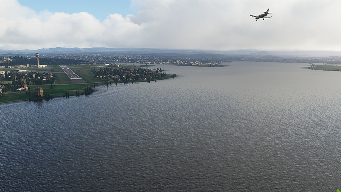
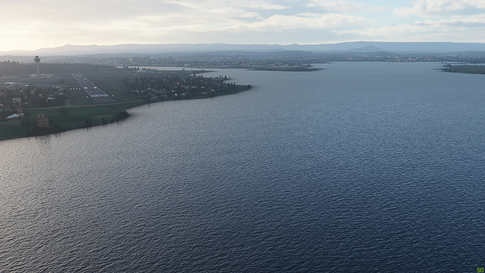
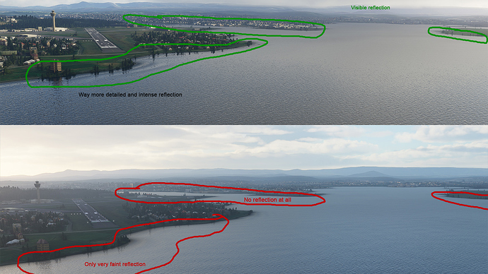
Comparison 1 - near Reykjavik, Iceland
I really struggled to get the lighting the same on this one. However, see what you think.
PRE PATCH 2: Here is the original screenshot (taken 21 Aug)
PRE PATCH 3: Here is one taken 21 Sep
POST PATCH 3: and here is one taken today (30 Sep)
I struggle to see a lot of difference. Look at the far away shoreline. TBH hard to tell if this is down to the lighting more than anything else. The weather and lighting on this one is very hard to recreate.
Let’s look in a bit more detail and zoom in on the far shore
PRE PATCH 2:
PRE PATCH 3::
POST PATCH 3:
Far away detail maybe looking slightly better?
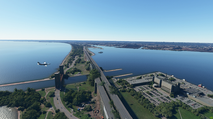
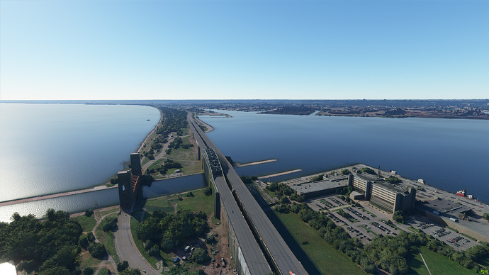
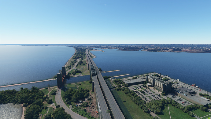
Comparison 2 - Hamilton, Lake Ontario
Did a better job with the lighting here (the live weather bug of showing only clear skies finally has a benefit ![]() )
)
PRE PATCH 2: 29 Aug
PRE PATCH 3: 21 Sep
POST PATCH 3: 30 Sep
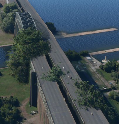
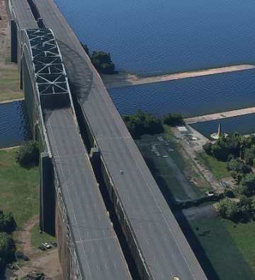
Note that this is a PG area - and the quality is immense, both before and after. What I notice is that the trees in the pre patch 2 picture that overlap the road/bridge have gone after patch 2 and after patch 3. Also, to my eye, this hasn’t been a general killing of trees as the other trees in the screenshots look pretty much the same. See the changes here:
PRE PATCH 2:
PRE PATCH 3:
POST PATCH 3:
So this looks much the same from pre patch 3 to post patch 3 and better than pre patch 2.
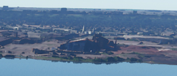
Distance doesn’t look very diferent either:
PRE PATCH 2:
PRE PATCH 3:
POST PATCH 3:
These look pretty much identical to me
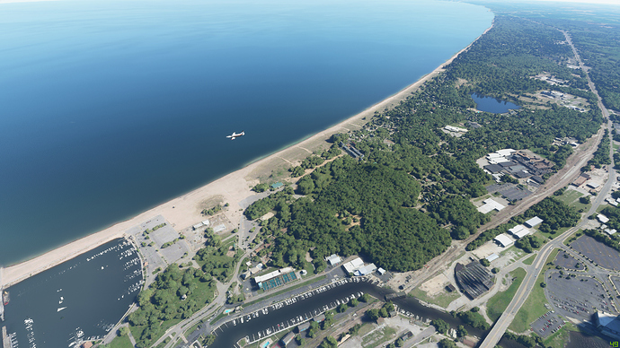
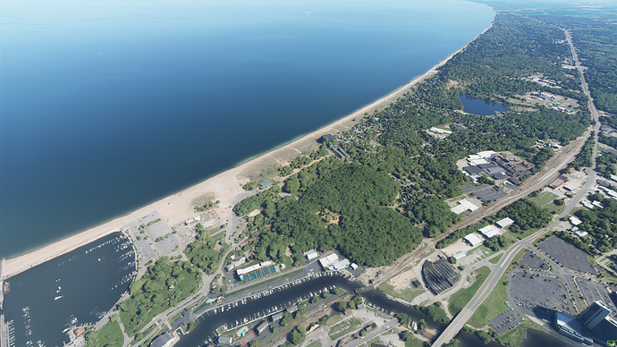
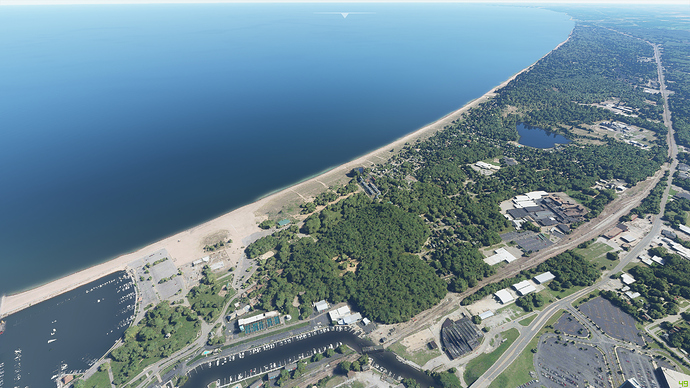
Comparison 3 - Michigan
Again, clear skies from live weather is our friend
PRE PATCH 2: 29 Aug
PRE PATCH 3: 21 Sep
POST PATCH 3: 30 Sep
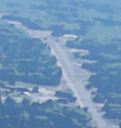
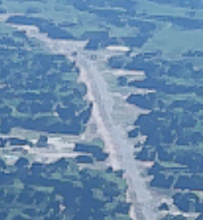
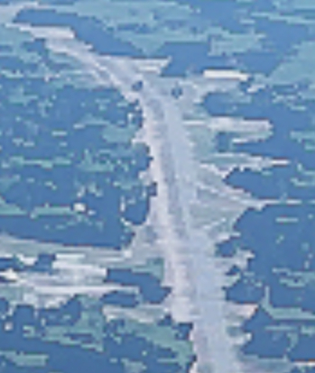
Near identical as far as I can tell between the 3 pics. Looking way off into the distance shows this:
PRE PATCH 2
PRE PATCH 3
POST PATCH 3
I don’t see any material difference here at all, especially pre patch 3 to post patch 3. The latter 2 are both slightly sharper than pre patch 2.
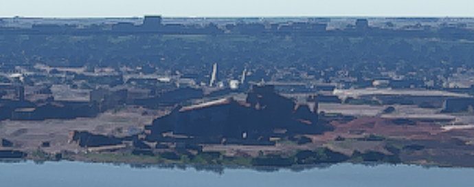
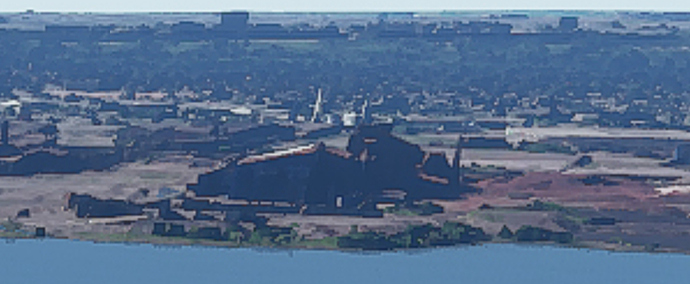
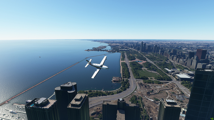
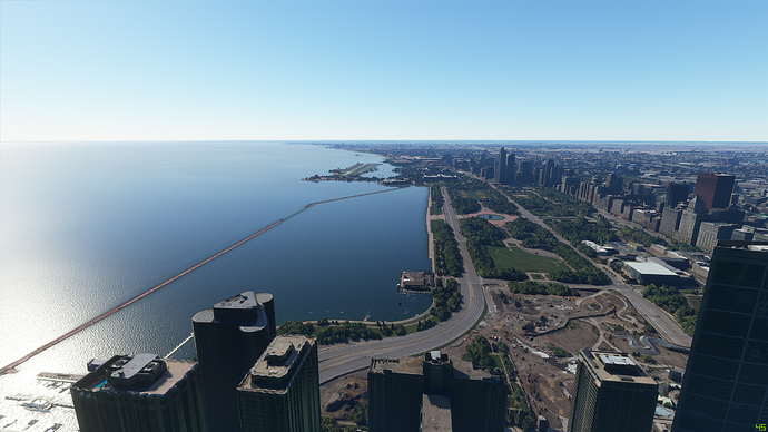
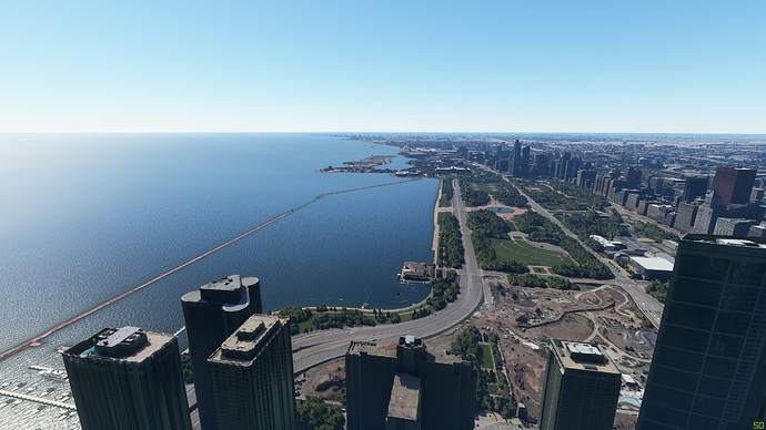
Comparison 4 - Chicago
PRE PATCH 2: 29 Aug
PRE PATCH 3: 21 Sep
POST PATCH 3: 30 Sep
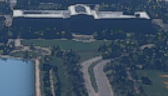
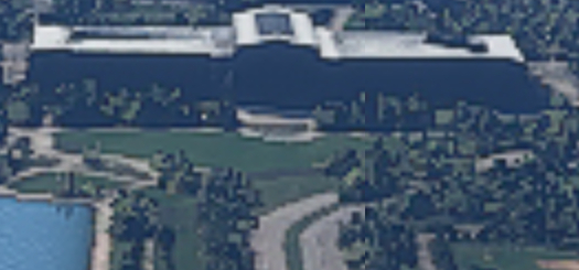
Again, near identical as far as I can see. Looking more closely at the distance
PRE PATCH 2:
PRE PATCH 3:
POST PATCH 3:
Post patch 3 looks slightly brighter and sharper maybe? I think I got about the same time of day and the right shadows, but definitely looks a little sharper.
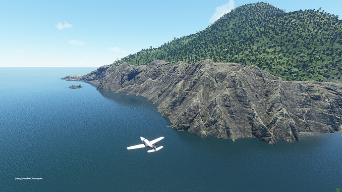
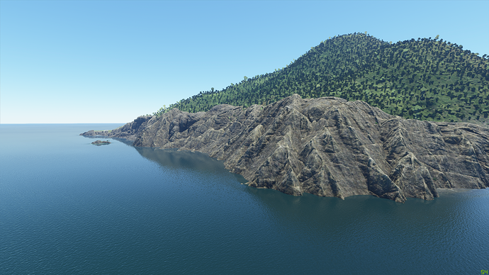
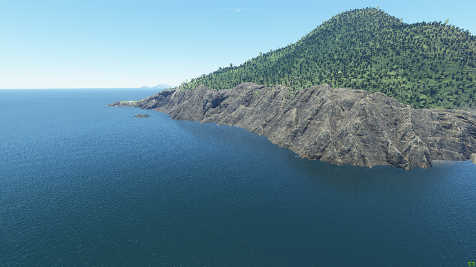
Comparison 5 - Saba
OK, by popular request, I previously got asked to do a Saba comparisons, so I’ve included it this time around too.
PRE PATCH 2: 11 Sep
PRE PATCH 3: 21 Sep
POST PATCH 3: 30 Sep
These look very similar, although the Post Patch 3 picture looks slightly lighter. This could be I just didn’t quite get the sun position the same.
However, the water reflection is definitely less pronounced post patch 3. It is hard to say that this isn’t realistic, but the reflection has definitely been toned down compared to both pre patch 2 and pre patch 3.
And up close
PRE PATCH 2:
PRE PATCH 3:
POST PATCH 3:
Again just seeing that slight lightening/sharpening effect. Again, I think I got the sun position as close as I could.
So there you go. As already noted, in patch 2 the trees were scaled back a bit, removed from overlapping some roads etc, and all of which the community aksed for after the initial launch. The only differences I can see from pre to post patch 3 are:
- maybe a little sharpening - but tiny if at all
- maybe a little lightening, but again a subtle shift
- water reflections toned down slightly
So, just to confirm that I don’t believe I have changed my settings at all pre and post, and the images I show as pre were taken on the dates shown. I have updated the nVidia drivers to the latest verison (456.55) - which may account for some of the change.
Hope this helps.


